Showing posts with label book structures. Show all posts

Wednesday, 6 April 2016

a definite beginning and end

Continuing on from Egidija’s last post I am going to take a look into curious structures. Or the curious structure of one particular book. 

A History of the Book in 100 Books, Roderick Cave and Sara Ayad - 2014

The Sulawesi reel-to-reel is a Lontar manuscript, created in South Sulawesi, Indonesia before 1907.

Lontar is the Indonesian word for for a palm leaf manuscript. It is the modern form of Old Javanese ‘Rontal’ which is composed of two Old Javanese words, ron "leaf" and tal "Borassus flabellifer, palmyra palm". Not only are the palms used for making books they are made into plaited mats, water scoops, ornaments, ritual tools, and writing material. The more traditional form of the Lontar is more recognisable, with strips of dried palm leaves held together with twine, between two strips of wood. 


An interesting side point is the way the form and material of the manuscripts have influenced the handwriting:

The rounded or diagonal shapes of the letters of many of the scripts of South India and Southeast Asia, such as Devanagari, Nandinagari, Telugu script, Lontara, the Javanese script, the Balinese alphabet, the Odia alphabet, the Burmese alphabet, the Tamil script and others may have developed as an adaptation to writing on palm leaves, as angular letters tend to split the leaf. Sanford Steever, 'Tamil Writing'; Kuipers & McDermott, 'Insular Southeast Asian Scripts', in Daniels & Bright, The World's Writing Systems, 1996, p. 426, 480
A History of the Book in 100 Books, Roderick Cave and Sara Ayad - 2014

Not much is know about this scroll variant but it is thought that the book was intended to be read from beginning to end so is probable that it was intended for formal use in ceremonies, where the order of things had to be recognised. It is interesting to think of it in this way. It is not a text that you can flick though like in the more conventional codex. It has a pace and an structured journey, that has to be undertaken. You have to follow it word for word.  It might be a thing to bear in mind when creating books. How much as an artist do I want to impose a route though my books. In some I guess I use text to draw you though but it is up to the reader what page they open up on. More recently I have been creating books based on journeys (see below) so It is interesting for me to see a book with a definite beginning and end. This is the route you take and you read the text in this order. Nothing gets mixed up and the author has more control over the interpretation of the piece. 


resources:
A History of the Book in 100 Books, Roderick Cave and Sara Ayad - 2014


Wednesday, 24 February 2016

Books Between Art and Science or Science and Art

Book exterior. Image source: Folia Water

A friend introduced me to this excellent project which aims to provide clean and safe drinking water to parts of the world that don't have access; the product is a book which contains advice and whose pages can be torn out to use as filters.

Book interior. Image source: Folia Water


According to the makers one page can filter water for up to a month and the entire book can filter water for a year.

Book as filter. Image source: Folia Water

I love the aesthetic of the book - the bound and embossed cover, the orange perforated pages with silver text. As this is a prototype, I wonder if the finished product would look dramatically different?

It is interesting that this book started as a scientific project, when it could have so easily been an art project - it's great to see how the two fields converge.

An example of the opposite - an artist whose work becomes scientific - could be Jamie Sholvin in his excellent project 'Various Arrangements' who used a mathematical formula to design covers for unreleased volumes of the iconic Fontana Modern Masters Book series.

Exhibition detail. Image source: Wire Frame

The project started when the artist noticed that ten forthcoming books were advertised but never released, so he created a loose formula to determine how the finished covers might look. 

Formula detail. Image source: Fontana Redux 

His 2012 exhibition at the Haunch of Venison exhibited his playful experiment and the book covers he has designed.

[Chris]

Wednesday, 20 January 2016

TV on the BOOK

Recently I have become very interested in the representation of the tv screen in the book. Not only because one of our projects had led us there but I have had a couple of books pop up which have explored this. One I have read and one that I have seen, they are both very beautiful in terms of design and aesthetic. In exploring structure, time and space the book functions much the same as video does although it has a slightly random and non linear one based on the choice of the reader. 

The fist book I am going to look at is a project that we have been working on. 

reading the book as an object - collective investigations

This book originated as a film as a book. Where the film takes the structure of the book. The screen divided into two ‘pages’ recreates a visual similarity with the open spread. With this framework the film slipped nicely back into the book form. It was interesting to see the volume the film took up when this was done. A screen capture was taken every second of a three minute film. The physical weight of the film is represented in the book  

Alice’s Adventures in Wonderland - and Through the Looking Glass

This book I came across quite recently and is quite a fun example of how you can portray a film within a book. The book being one that already exists in a literature sense has been adapted for film. Like our project this film adaption finds itself back in the book. Though this time it is a frame by frame analysis done in line drawings with text. These are interspersed with photos of the cast. Whats on screen is interpreted for a printed book and layered with the bookish elements of text.


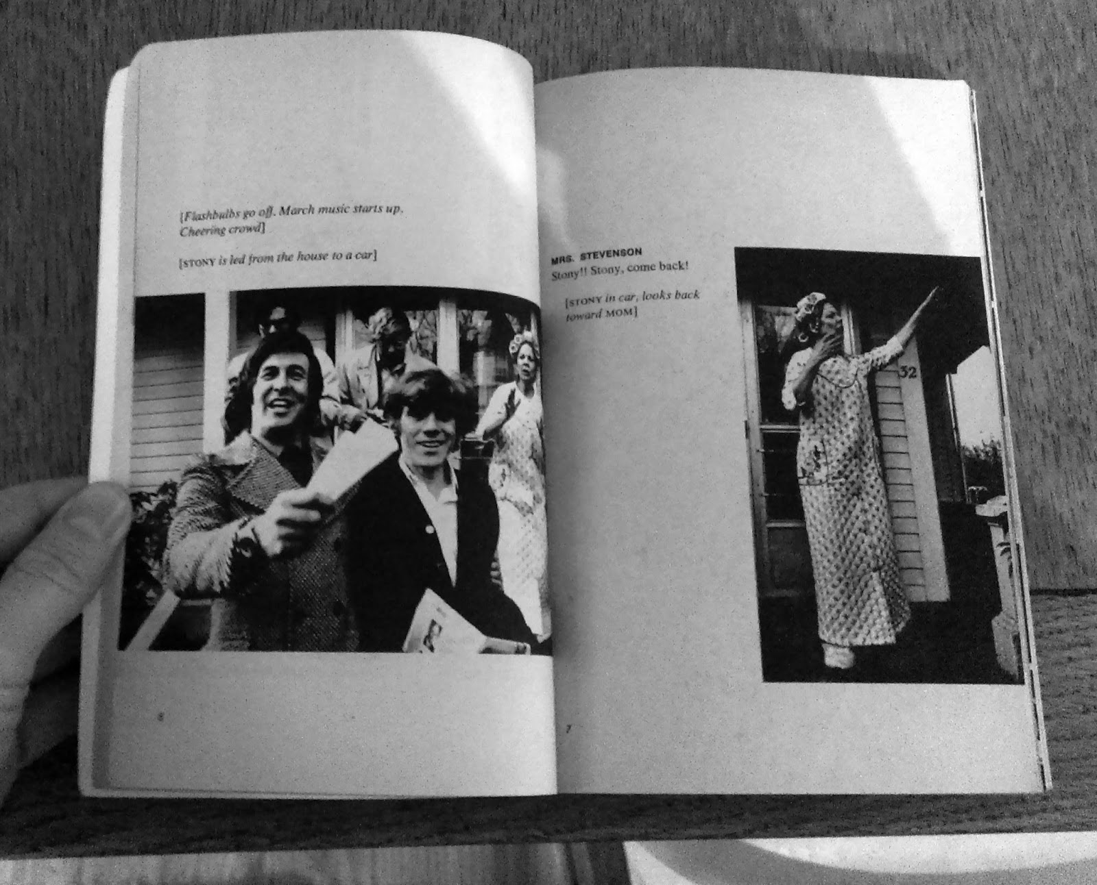
Between Time and Timbuktu - Kurt Vonnegut

One of my favourite authors Kurt Vonnegut wrote a television film in 1972. The film was published as a book in the same year. The script is published along with stills and photos from the film. When I discovered this book I had a sense of pure delight. Not only because I enjoy his work but the simplicity and clarity of the design gives it a graphic novel feel. It is a great study in how image and text can work together. It is not a pure representation of what happened on the screen in the way that reading the book as an object is. It supplements the TV with the quality of the book. That of the story. Presented as a script, you can read it as a novel but it retains that immediacy of TV. It is TV slowed down, TV that goes at your own pace.


Wednesday, 13 January 2016

GUEST POST: The concertina. The accordion. The oriental fold. (Erin K. Schmidt)


The concertina sets itself apart from other book structures in its distinctive form of repetitive folds which allows a versatility in presentation and viewing. The variation in physical space that a concertina book can create and occupy creates a shifting relationship between content and form. The folded pages can be held together on one end and turned like those of a codex between the covers, politely requiring very little space. When the concertina behaves like a codex it allows only a fragment of the content to be visible at any given time.

The pages of a concertina can also spill out beyond those borders of the cover, boasting the content within the book. When the pages of the concertina are extended, the contents on each side are displayed all at once allowing the viewer to engage with the contents in its entirety.


The folds allow the book to harness and capture space, to create an enclosed environment with the slightest manipulation of the page, or to fully extend and occupy as much space as possible. Shadows are created within the space, deeper and darker with the closeness of page; light and airy upon opening. These shadows are part of the play of the book and its content, and can, with subtle movement, affect the overall tone of the work.


In my book the house in the wood I have placed two concertinas within the hardcover such that the cover closes and presents itself as a codex with the spine on the left. Because of this cover, the book can readily be viewed as codex, turning the pages as such to read the text without having to hold them together at the left.


The book can also be opened wide to allow the concertinas that have been nestled within the cover to spread out and expand. When extended, the two concertinas reveal their backsides which contain multiple images of small mushrooms. Because of the folds in the concertinas, the pages can be manipulated and moved to various positions for viewing. The space that is created between the concertinas becomes an extension of the forest floor connecting the images to each other.


I chose this format of using two concertinas for house in the wood which extend in different directions to correspond with the text of the book which describes the two paths that lead the viewer away from the house and into the forest. As the paths bend and wind, the concertina folds allow the paper to be manipulated similarly.


For my book tea and water pipe, I’ve chosen to use a double concertina. The doubling of the concertina creates a physical space between the layers, as well as the space that the structure itself already occupies due to the nature of its folds and shape. When the book is open and extended the structure becomes the setting of the book, a tea house in which the narrative occurs.


I have placed the text on the interior pages such that it can only be viewed by looking through the lattice windows that have been cut into the front layer of the concertina. In this way the viewer must enter the work as a voyeur peering into the space from the outside. The outer concertina creates a physical barrier between the viewer and the text, a private lament for a departed friend, some of the thoughts so quiet the words are barely visible.


The concertina is a dynamic marriage of content and structure. The flexibility of the book requires a flexibility of content. I consider this when I choose to use the concertina structure in my work. The content must work when viewed in fragments as well as when viewed as a whole. The interplay of shadow and form should complement the content, and vice versa. The folded pages will create small, private spaces for the viewer to dwell, whether in shadow or light. It is important, within these spaces, to offer a quiet moment of intimacy that the viewer may share with the book.


More concertina books by Schmidt:

Lament
Long Blond  Hair
Muse
God Save the Queen


Erin K. Schmidt is an American artist, whose artwork is heavily influenced by notions of identity created through personal histories, memories, and perceptions. Her books focus on brief moments, punctuated by repeated imagery or text, recalling intimate events or memories. She uses private photos and writing within a variety of structures and media to evoke emotions. She earned her BFA from Michigan State University and her MA in Book Arts from University of the Arts London. She has been awarded Shefield International Artist’s Book Prize in 2014. Her work has been exhibited internationally and can be found in private and public collections including Tate Britain, London, UK; Saison Poetry Library, London, UK; University of California San Diego;  RISD.