Showing posts with label Art: book. Show all posts

Wednesday, 15 June 2016

Documenting Artists' Books

After a recent embarrassment of handing out a business card to a friend and gently being asked why my website was almost empty, I resolved to spend some time bringing it up to scratch (i.e. adding at least some coherent content to it!).

Original - Cover
Original - Interior
Starting the process I soon remembered why I had given up months before. Building a website and adding content in a straightforward, appealing way is quite a challenge and central to that challenge is taking clear documentation. I overcame the problem in quite a straight forward way, so I wanted to talk about it here. I'll use the example of an artwork called 'Between the Lines'.

The two original photos (above) were taken with my smartphone from the slightly battered proof copy that arrived from the printer. It was hasty because I wanted to get the photos on my website in time for them going on sale at the Whitechapel Book Fair. Shamefully I've been using those photos ever since!

One simple way of establishing how I wanted the new documentation to look was by addressing what I didn't like about the old photographs:
  • Both of my original images were cropped and didn't give a true impression of the cover design or the page layout. I had originally taken the photos like this in an attempt to make them look visually interesting and (particularly regarding the cover) to hide the roughness of the book itself. As the book is merely documentation, I realised that clarity was more important than visual interest, so documented the cover and pages in their entirety and from above.
  • Both images are different sizes (one square, the other rectangular), so they looked uneven next to each other. The simple solution to this was to choose a standard size - making them square meant that I didn't have to remember what ratio I had picked.
  • Using my smart phone camera meant that the colours were very uneven. The simple solution to this was to use a better camera.
  • The background didn't match other documentation, so I opted to pick a particular shade and use that across all my documentation.

Strange how these things sound so simple, but had never really occurred to me before. So I set up a little studio in my front room and took some photos with my compact camera.

Using this set-up the only two elements that I needed to control were the background and quality of the image. These could be done together in Photoshop. All I had to do was to separate the book and the background and work on them separately.

For the book element I improved the contrast and changed the colours slightly to match the original. For the background I increased the contrast so that the paper textures of the background disappeared, but the shadow stayed. I then filled the background with a specific shade of the grey that provided a contrast. Noting down the details of the shade of grey were important, as I then used the same shade on all subsequent documentation. The finished images are here:

New - Cover
New - Interior
Below these are other books that I documented using the same technique - I hope it gives you an idea of how straight forward the process can be.

Mrs Dalloway Variations

Mrs Dalloway Variations


[Chris]

Wednesday, 18 May 2016

Making Books as a Ritual

I was recently reminded of Donald Parsnips Daily Journal: a publication made and distributed daily by the artist Adam Dant in the Spitalfields over a five year period. The artist printed 100 copies each day and handed them out on his way to work.

Donald Parsnips Daily Journal - 8th July 1998. Image Source: Artnet.

When I first came across the artwork, during my BA in Fine Art I was inspired by it (and by a similar, and more intimate artwork by a friend Rose Clout), particularly for the artist's focus and persistence; the fact that day in and day out they kept creating. Collectively the body of resulting work had impact, in much the same way as a retrospective of On Karawa's date paintings might have; the artworks are tangible results of a quest for perfection. Some of the glow from these works may come from the realisation that the artist has sacrificed some part of their life to this cause. To a young artist as I was, there was something heroic in this and perhaps romantic; the struggling artist personified.

On Kawara's Today series. Image Source: Art Bouillon.

Ten years later when I embarked on my MA in Book Arts, I dabbled in this ritualistic process myself over the course of the works:

Your Day is My Day was a publication I created daily, produced and printed on the same day and left in a location related to the content. The intention was that someone would find the 'book' and realise it relates to the place they were standing and perhaps make them conscious of where they were at that moment and what they were doing; a prompt for self-reflection.

This idea morphed into another work of art a year later. For a group show called Overdue I placed a book wrapped in paper in a vitrine in Camberwell College's library. The book contained a QR code on the front, which linked to an ebook created by me that could be downloaded each day. The book changed each day, implying the fluidity of books within the digital realm.

Wrapped book in vitrine
Detail of artwork in one of the ebooks.


The next time I worked in a similar way was for an exhibition at bookartbookshop as part of Collective Investigations. I created four stacks of book pages, each with a brief story on each (relating to the place in the shop where they were left) and embedded with a QR code. When scanned the the viewer would be taken to a page online, where the text would be redrafted day by day until it became unrecognisable.

One of the stacks of paper in situ.
None of these projects were carried out on the scale of Adam Dant's or On Kawara's, but each was difficult and rewarding in their own way. On the positive side the projects pushed me to work to a deadline each day and the time constraints meant I couldn't be too precious about the end result. The time-pressure and the ongoing nature of the works pushed me to be inventive and think of something new each day and these ideas, although not groundbreaking themselves, did germinate other ideas for later artworks. The only real negative of this way of working was that the rushed nature of some of the works meant that individual details were not completed with the standard of quality I would usually work to.

[Chris]


Wednesday, 27 April 2016

→ intimate and cathartic is the constellation of cancer


Speaking in Tongues: Speaking Digitally / Digitally Speaking (2015) by David Paton


"Intimate and cathartic" refers to both: the process of making a book and the process of reading. Book as an object encourages intimate interaction between the maker and the object, the object and the reader. Art as an activity veers towards the cathartic experiences between the artist and the object; the object and the viewer. Adding to that a medical context, results in Medical Humanities and an approach to art, which considers artist’s books as a tool to aid healing and facilitate communication between doctors and patients.


Test Day II (1999) by Martha A. Hall


I was honoured to co-organise with Dr Stella Bolaki Prescriptions exhibition, which is now open until August 14 at The Beaney House of Art and Knowledge, Canterbury. The exhibition is part of Artists’ Books and the Medical Humanities project by the University of Kent’s School of English. It was originally structured around a set of Martha A Hall’s books, which she created from 1998 until her death in 2003 to document her experiences with breast cancer and interactions with the medical community. To extend Prescriptions further, I initiated an open-call, which resulted in over 200 artists worldwide submitting nearly 250 works, of which 88 bookworks were selected as a curated Medical Humanities artist's books collection, reflecting on the themes of illness, grieving, disability, mental health, surgery, birth, aging, recovery, history of medicine, treatments and wellbeing. Once the exhibition is over, the collection will be housed at University of Kent’s Library's Special Collection.


View of Prescriptions at The Beaney, Canterbury.


Illness, healing, grief are intimate processes. Like Martha A Hall, a number of Prescriptions artists have responded to their conditions by making books: some dealt with  their own diagnosis, others dealt with the grief at the illness of a friend. Like Martha A Hall, 25 of the participants have cancers, of which 11 are breast cancer patients and further 4 are friends or family of a breast cancer patient. 


→ 


Cancer is one of the twelve constellations of the zodiac. Its name is Latin for crab and it is commonly represented as one. Its astrological symbol is ♋. Cancer is a medium-size constellation with an area of 506 square degrees and its stars are rather faint. Cancer is the dimmest of the zodiacal constellations, having only two stars above the fourth magnitude.


Cancer is frequently represented as a combination of five stars. 


1. Lizzie Brewer
The first star in my Cancer constellation is Lizzie Brewer. Lizzie's work Prescriptions is a set of embossed prints, which reflect on the amount of pills taken during the five years of her breast cancer treatment. Each tablet is one little step towards healing: her work shows a long journey. Repetition is what stands out in Lizzie’s work: tablets look the same, pages look the same. There is meditative quality to an ongoing expanse of sheet after sheet after sheet. Other then details of her surgical report there are no other texts and there are no images. The person behind this data is very much absent - repetition hides her like a smokescreen.


 2. Carole Cluer
Carol Cluer was diagnosed with breast cancer in 2004. Unknown is another seemingly detached work, which hides individual well behind volume, number and data. Carole considers the number of people diagnosed with breast cancer in the same year as her. Based on the measurement grids and tattoos used when you have radiotherapy, she had drawn a grid by dragging a fine gold wire across paper, so each dot represents one person - anonymous person - like herself. The books consist of pages and pages and pages of identical looking hand drawn grids: simple to look at, but exquisitely executed. If Lizzie’s work zooms into individual’s experience, Carol’s work zooms out to globalize it, by re-contextualising herself into the worldwide stream of data. 


3. Carol Pairaudeau
 
If individual is hiding behind the data in two previous two works, Carole Pairaudeau puts herself right into the center of her book. Not only is the work presented in a hospital sample bag with Carole's name printed on it, her book is a concertina, showing her scar and bruising on one side and words (about healing of the scar) on the other. The photo images of bruised skin are otherworldly in their blues, greens and purples. Their beautiful and painterly quality contrasts with their painful origin. The text complements images: it transports reader through stitch to fade of the scar in three concertina folds, producing six steps. Like in Lizzie’s work, Carol’s work is about time and healing. The steps might be bigger and may take more time of complete, but the work feels cathartic and emotionally true.

4. Ruchika Wason Singh
 
Ruchika Wason Singh builds her book as a journey of acceptance at the loss of her breast. Physical and emotional healing is replicated in her creative process. Ruchika paints breasts and tears them into pieces, which she then restores by painting onto them. She resurrects the breast visually as she completes her inner transformation into an honest acknowledgment of her situation. Ruchika then pastes images onto sheets of paper to form a book, which further contributes to the idea of archiving the experience. Her set of collages is loosely held together by fabric, resembling bandages. The cover image is a stitched scar. The book is wholesome, bold and honest. Ruchika’s work elicits anguish and grief that feel resolved as the book is closed.


5. Mara Acoma
A photo book by Mara Acoma documents her own experience of having her mother diagnosed with breast cancer. The work, Mara says, allowed her to demystify her own emotional journey. She is using the visual language of near death experiences and folklore surrounding ghosts. The images are dark, produced to the backdrop of gothic sets of crumbling castles, gloomy forests, abandoned hospitals and misted up windows. A lone ghost of a heroine is moving from one location to the next across sprawling spreads of large size monochromatic photographs. Those imaginary locations represent her mental states, which - like Lizzie’s tablet’s or Carole’s bruises - are steps towards emotional healing. 


→
 

Intimate and cathartic is a diary for the writer, as it is for the reader. The books above are diaries in the most generic sense of the word. They are non-verbal diaries. Their authors reach beyond language to say the unsayable. The (almost) lack of language evokes universal readability of the artwork, which in turn, resonates with universal concerns of understanding illness and understanding healing as a process.


[Egidija]


Wednesday, 20 April 2016

The Complete Virginia Woolf - an eBook as a labour of love

Although I’ve changed ebook-readers a few times over the years, one book that has remained ‘constantly’ on my virtual shelf is the Complete Works of Virginia Woolf. It’s a beautiful volume, which seems to have been a real labour of love for the maker. I hesitated when I wrote the word ‘constant’, because as you’ll see the book as evolved a lot over the years.

The Complete Works of Virginia Woolf - book cover. Image source: Mobileread.
The Complete Works is an ebook created by the user Pynch on the ebook site Mobileread. As background Mobileread is an online community where users format and upload books that are in the public domain. In this case Pynch compiled the complete works of Virginia Woolf in one volume and uploaded it in 2012. Since then the volume has undergone 15 revisions (errors have been corrected, formatting conventions smoothed out and huge volumes of new material added).

When we think of books as a labour of love, I suspect ebooks aren’t the first things that spring to mind, perhaps a beautifully bound manuscript might be more apt, or something personalised in some way, or an example of excellent design. Ebooks have more of a cold, utilitarian connotation - they are after all devoid of so many elements we fetishise in paper books (the smell, the touch, the familiarity etc.)

Picture of Dorian Gray Interior
The Picture of Dorian Gray Cover
Book-binder Mark Cockram's beautiful books have been exhibited widely and often use mixed materials, striking end pages and interventions to the edges and interiors, enclosing and reframing an existing novel, to draw out certain plot points or create a certain tactility in the hands. (The images here show Cockram's bold rebinding of Wilde's The Picture of Dorian Gray).

The Complete Virginia Woolf has a cover that breaks from traditional convention (its restrained design and subdued colours compliment the text, without being showy or eye-catching) and uses Vanessa Bell's original woodcut cover designs to mark each individual work that comprises the collection. Instead of being merely a 9,500 page book, the use of Bell's imagery nicely packages the works, differentiating them from one another. Connecting Virginia's writing with the images that her sister conceived to accompany them, gives history to the collection, tying it to its original production.

Mrs. Dalloway section of the Complete Works.
Original Hogarth Press cover design by Vanessa Bell

Graham Rawle is a fascinating artist whose books often layer found imagery to build up a new story or give a certain depth or feeling to an existing one. The Complete Works of Virginia Woolf is a work in constant revision and as such also gains a certain gravity the more texts are added, or the further existing texts are revised or the design improved upon.

Pages from Rawle's Woman's World, 2005

Pages from Rawle's edition of The Wizard of Oz, 2008
Were this edition released by a major publisher we might remark what an achievement to bring such diverse material together, but to say the book is down to the labour of one individual means so much more. Our having evidence of the constant addition and improvement makes this all the more impressive, as it reminds us of the labour involved; with edition after edition we're made aware of the hands of the maker.

Penguin's Great Ideas series (released in 2004 and designed by David Pearson) is a excellent example of simple design and attention to detail that enhances a book, making it a pleasure to read. The designer's thoughtful and pared down aesthetic and attention to detail (such as the use of embossing and mixing type faces) harks back to both the simple Penguin covers of yesteryear and old fashioned printing techniques (such as letterpress).

Penguin Great Ideas Vol. 1 - spines
Penguin Great Ideas Vol. 1 - cover

One of the pleasures of The Complete Works is the crispness of design - typographic conventions are shared across the 30+ volumes that make up the collection and design is unified right across the 9,500 pages. In a world where even the big publishers can't always get formatting consistent (in a hard-back edition of Mrs. Dalloway I own the text is printed differently on alternate pages, making for a jarring experience and the references that accompany the text contain obvious errors), the ease of reading The Complete Works is refreshing.

As with many labours of love, the work has flaws (as each revision of the document testifies) but to say that it has been been created by one person, spurred on by helpful comments and encouragement, makes it all the more personal. Oh, and did I mention that in a bout of productive-procrastination I decided the Complete Letters of Virginia Woolf and Lytton Strachey  needed transcribing? You'll find it in this volume!

Why not pop along to Mobileread and get your copy now? Remember to keep checking back for revisions.

[Chris]

Wednesday, 9 March 2016

GUEST POST: From Books to Printed Matter (A brief history of Highchair Editions by Edward Newton)


With the recent boom in self and small scale independent publishing, the book has, in many ways, taken centre stage in the world of photography. Everyone wants to publish a book! I, of course, was no different when I started Highchair Editions in 2011. It was set up with my brother as a self publishing imprint for our personal self initiated projects.

From the outset we made in our minds a clear distinction that we were making artist books rather than large volume trade editions.  There were a number of reasons that led us to print small editions. Firstly it was financial, followed very closely by what we felt was something of a creative restriction of producing something in volume as well as the unknown landscape of distribution and audience. As things began we were blind to many of the nuts and bolts of the process, we just wanted to print something.


Printing
At the start we were also led by the choice of printing technique. Inkjet printing for some is still something of a dirty word. Very few people seem to want to make direct reference to it. For us the process allowed us to find our book making feet so to speak in the fact that it offered us complete in house control over the production from making the early dummies to the finished publication. It also allowed us the opportunity, through a lot of trial and error, to print on a huge number of different non inkjet specific paper stocks. By doing so we were able to eliminate a huge number of options and discover a few real surprises.


Our first happy accident was to print on sugar paper, also known as construction paper and used today mainly in primary school art classes.  Its rough surface has a beautiful tactile quality which really lent itself to the work we were printing.  It’s rough but has stability and at 140gsm meant we could book stitch bind it and more significantly it printed well, holding black particularly well.


On the other end of the paper scale was a GF Smith paper stock Accent smooth, an off-white ‘smart’ paper with a significantly smoother surface than we had used before. It offered elegance in both presentation and print for a series of abstract, tonally subtle images.


We continued to experiment with paper options and moved towards using coloured stocks, albeit in shades of light brown, culminating in ‘The Light Was Rust’. This particular publication features work made in the Italian city of Palermo and uses a light straw coloured stock in two weights for cover and bulk. The shade and texture of the paper lend themselves to the tone and texture of the city itself, and, much like the place itself was an attempt to marry certain elegance with an informality and roughness.


Design
My attitude to design and what constitutes a book has changed quite significantly in the five years of Highchair Editions, in fact we may now consider our productions as printed matter rather than books! A small but significant shift in attitude and approach has led to a variety of formats being produced, the main driving force being the aim to design specifically around the work and not have a one size fits all approach. We have always wanted to start from scratch each time we begin a project, and, in some ways react against the last one. With ‘This time next year’ we used a salvaged wall paper for the front cover, it was a book made up primarily of domestic scenes from around the house so the material lent itself towards feelings of the home. However it was also very pretty and as a reaction led us to make ‘Trampolines and Bouncy’ castles, an ugly book made up of ugly images!


More recently, any experimentation has been in format as much as with materials. ‘nothing at the moment’ is something of a follow up to the earlier mentioned This time next year’ and continues to explore the home and domestic scenes. The finished publication is part portfolio, part book, and is made simply of seven sheets folded and then housed in a small band, it is content driven, 14 photographs, no text.


It was stripping back the process to the bare bones, thinking about what the key components are and very much an attitude of less is more, an idea that culminated with ‘Unknown’. 


As something of an antidote to the white space of ‘nothing at the moment’ and ‘unknown’ we made ‘FORZA’.  The work, made in the Italian city of Genoa, covers every surface of the publication, a publication that functions as part concertina book and part poster. It’s loosely bound with elastic to fold out to reveal a larger image and can be read as individual pictures or a complete set. The format is simply two sheets of paper that fold down, with the smaller sheet functioning as a cover of sorts. It was made with the specific city in mind, in that it is compact with little space but if you begin to look it will reveal itself to you.


So as we continue to develop the practice of self publishing many of our original ideas and aims remain, in fact, very little has changed in terms of attitude and intention, this despite some changes in the landscape as a whole.  We’ll continue to pursue our own ideas and focus on image based content presented in the most suitable and hopefully interesting way as possible.


Edward Newton
(Highchair Editions)


Wednesday, 24 February 2016

Books Between Art and Science or Science and Art

Book exterior. Image source: Folia Water

A friend introduced me to this excellent project which aims to provide clean and safe drinking water to parts of the world that don't have access; the product is a book which contains advice and whose pages can be torn out to use as filters.

Book interior. Image source: Folia Water


According to the makers one page can filter water for up to a month and the entire book can filter water for a year.

Book as filter. Image source: Folia Water

I love the aesthetic of the book - the bound and embossed cover, the orange perforated pages with silver text. As this is a prototype, I wonder if the finished product would look dramatically different?

It is interesting that this book started as a scientific project, when it could have so easily been an art project - it's great to see how the two fields converge.

An example of the opposite - an artist whose work becomes scientific - could be Jamie Sholvin in his excellent project 'Various Arrangements' who used a mathematical formula to design covers for unreleased volumes of the iconic Fontana Modern Masters Book series.

Exhibition detail. Image source: Wire Frame

The project started when the artist noticed that ten forthcoming books were advertised but never released, so he created a loose formula to determine how the finished covers might look. 

Formula detail. Image source: Fontana Redux 

His 2012 exhibition at the Haunch of Venison exhibited his playful experiment and the book covers he has designed.

[Chris]

Wednesday, 2 December 2015

Exhibition: Anselm Kiefer, 'L’alchimie du livre / The Alchemy of Books' at La Bibliothèque nationale de France

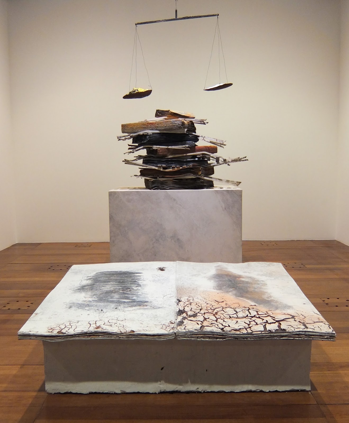
Installation view of 'Ton âge et mon âge et l'âge du monde', 2005 and 'Nigredo', 1998.

Recently I got chance to see a retrospective of Anselm Kiefer's book works at the megalithic Bibliothèque  Nationale François-Mitterand in Paris; a building that I love for its sheer audacity (how many other libraries have a wood planted right in the middle of them?).

Library Exterior.
During the course of my studies I'd heard a lot about Kiefer's books, particularly in relation to their earthy, organic qualities. And because books are often such small, intimate objects, I was keen to see the scale of the works.

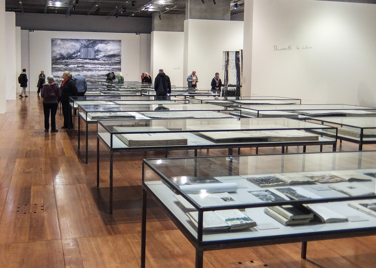
I have never seen an exhibition at the Bibliotheque National before, but the gallery was bigger than I expected. The room is made up of an open central space with vitrines of more traditional books and three alcoves on each side, housing the bigger, more physical books.


The first alcove on each side is called 'A Library Of Artists' Books' and have been made to look like archives with their utilitarian grey metal shelving. The shelves hold large (around 1m square) seemingly perfect-bound books. The thick pages have a quality of children's board books, but the content and construction is more akin to a sketch book or a journal. It is easy to imagine that each book is preparation for an artwork. Filed among these are boxes (presumably of books or loose-leaves), sculptural objects and vitrines. The effect is like a behind-the-scenes view of the artist's studio. The huge tomes have a real sense of gravity and even though they can't be read, these reading rooms are still immersive and contemplative spaces.

A Library of Artists Books, 2015

Subsequent alcoves feature large sculptural works - a particular favourite was the installation featuring 'Ton âge et mon âge et l'âge du monde' (2005) and 'Nigredo' (1998) (shown at the top of the page) as the balance between the organic and the bookish in the works seemed just right. Kiefer's work is confident and complex, but the familiar form and the earthy colours lend a warmth to it. This may also on part explain the artist's appeal to those on the Book Arts course I was on.

Le Livre, 2007 (detail)
 'Lichtung (Clairière)', 2015 (detail)
The front and back walls are flanked by large-scale, heavily layered paintings each of which incorporated a book form. I like the symbolic use of the book form within the composition, and although such a deep layering can make paintings very dense for me they certainly had a lot of energy and they enclosed the space very well.

In the vitrines down the middle of the room are a broad range of the artist's books. Many are open and although they can't be touched, the viewer is given a hint as to their contents. In an exhibition like this is not necessary to be able to handle these works, particularly as many are much closer to sculpture than an actual book.

'Les Reines de France', 1996 (detail)

Leaving the exhibition I was impressed with how prolific Kiefer is and how consistent his work is. I feel lucky to have had the chance to see the work and particularly in such a relevant context.

'The Alchemy of Books' continues until 7th February 2016.

[Chris]