Showing posts with label Chris. Show all posts

Wednesday, 6 July 2016

Three Unconventional Narrative Structures

Narrative takes a central role in most, if not all of my artworks. I am often to keen to tell a story, something that develops over time. When it comes to site-specific works that I have made, the narrative might even be driven by details from a place.

Recently, my artwork has been becoming more stand-alone and often a narrative will be confined to just one book (as opposed to a series) and because of this I have been keen to think how I might escape the linearity of the form. Instead of looking out there at other book-objects, I will look at three works in different media to see whether ideas from those could translate across.

Journey Into Fear, Stan Douglas
The first is a video installation called Journey Into Fear by Stan Douglas (2001), which I saw at the Serpentine Gallery many years ago. The work is a single screen projection which at first glance appears to be a feature film; some kind of drama set on a ship. The film is mostly made up of exchanges between characters inside the boat - these scenes are interspersed with exterior shots or views of the ship at sea. Except for the exchanges appearing a little cryptic and the dialogue jarring slightly, as if it has been dubbed, the film seems like any other thriller of the genre. Things begin to change however once the viewer sees the same scene repeated, but with the characters saying different dialogue. It turns out that the scenes loop randomly and have several possible dialogue tracks for each, changing the nature of the interaction and subsequently the flow of the story itself. A viewer would have to watch the film for 157 minutes to witness all the possible permutations - this in itself means that each gallery visitor is likely to have a slightly different experience of the artwork, as they are unlikely to see the entire work.

Her Story, Main Screen.

The second example I would like to talk about is Her Story; a video game (Android and Apple) where players must assume the role of a detective, watching interview footage from a case in order to work out the details and solve it. On the surface the game sounds straightforward, but compared to others, it is pretty unique. When you first open the app you are presented with the desktop search terminal from a police computer (circa 1994) and apart from viewing the 'Read Me' files on the desktop, all you can do is enter key words into the search bar and view the footage that is returned.

Her Story, Interview Footage
Each interview clip is short, only giving you a partial scene, so you are forced to think up different key words (terms that you think might appear in a dialogue) in order to piece the scenario together. This technique makes the game mysterious, but compelling, as the player has to listen and look out for clues that might suggest a key word or phrase that might broaden the search. As clips are sorted by key words and not date, the player might be hearing interview footage from any part of the enquiry. Playing the game makes you feel like you are creating a huge jigsaw, but without knowing how many pieces you have left. This narrative device is fascinating and hugely compulsive.

Still from Imitation of Life.
Imitation of Life is an imaginative music video for the group R.E.M., which features a crowded scene at what appears to be a party. The camera zooms in and out and the footage plays backwards and forwards throughout the video, highlighting snippets of action at the party. The thread that ties the video is that characters in the midst of actions at the party appear to be lip-syncing the words to the song. The technical devices used make us unaware of the real duration of the events we are seeing, and the constant refocusing of the frame tease out new narratives, making us think of the endless possibility in each moment.


Still from Imitation of Life.


Is there scope for this type of story telling in the book form? Could the author replay scenes but with different elements as Stan Douglas does, or could a reader be guided through a book in different ways in order to discover different events first as in Her Story? Or maybe the reader could pick a new narrative out of an existing one like Imitation of Life? 

[Chris]

Wednesday, 15 June 2016

Documenting Artists' Books

After a recent embarrassment of handing out a business card to a friend and gently being asked why my website was almost empty, I resolved to spend some time bringing it up to scratch (i.e. adding at least some coherent content to it!).

Original - Cover
Original - Interior
Starting the process I soon remembered why I had given up months before. Building a website and adding content in a straightforward, appealing way is quite a challenge and central to that challenge is taking clear documentation. I overcame the problem in quite a straight forward way, so I wanted to talk about it here. I'll use the example of an artwork called 'Between the Lines'.

The two original photos (above) were taken with my smartphone from the slightly battered proof copy that arrived from the printer. It was hasty because I wanted to get the photos on my website in time for them going on sale at the Whitechapel Book Fair. Shamefully I've been using those photos ever since!

One simple way of establishing how I wanted the new documentation to look was by addressing what I didn't like about the old photographs:
  • Both of my original images were cropped and didn't give a true impression of the cover design or the page layout. I had originally taken the photos like this in an attempt to make them look visually interesting and (particularly regarding the cover) to hide the roughness of the book itself. As the book is merely documentation, I realised that clarity was more important than visual interest, so documented the cover and pages in their entirety and from above.
  • Both images are different sizes (one square, the other rectangular), so they looked uneven next to each other. The simple solution to this was to choose a standard size - making them square meant that I didn't have to remember what ratio I had picked.
  • Using my smart phone camera meant that the colours were very uneven. The simple solution to this was to use a better camera.
  • The background didn't match other documentation, so I opted to pick a particular shade and use that across all my documentation.

Strange how these things sound so simple, but had never really occurred to me before. So I set up a little studio in my front room and took some photos with my compact camera.

Using this set-up the only two elements that I needed to control were the background and quality of the image. These could be done together in Photoshop. All I had to do was to separate the book and the background and work on them separately.

For the book element I improved the contrast and changed the colours slightly to match the original. For the background I increased the contrast so that the paper textures of the background disappeared, but the shadow stayed. I then filled the background with a specific shade of the grey that provided a contrast. Noting down the details of the shade of grey were important, as I then used the same shade on all subsequent documentation. The finished images are here:

New - Cover
New - Interior
Below these are other books that I documented using the same technique - I hope it gives you an idea of how straight forward the process can be.

Mrs Dalloway Variations

Mrs Dalloway Variations


[Chris]

Wednesday, 18 May 2016

Making Books as a Ritual

I was recently reminded of Donald Parsnips Daily Journal: a publication made and distributed daily by the artist Adam Dant in the Spitalfields over a five year period. The artist printed 100 copies each day and handed them out on his way to work.

Donald Parsnips Daily Journal - 8th July 1998. Image Source: Artnet.

When I first came across the artwork, during my BA in Fine Art I was inspired by it (and by a similar, and more intimate artwork by a friend Rose Clout), particularly for the artist's focus and persistence; the fact that day in and day out they kept creating. Collectively the body of resulting work had impact, in much the same way as a retrospective of On Karawa's date paintings might have; the artworks are tangible results of a quest for perfection. Some of the glow from these works may come from the realisation that the artist has sacrificed some part of their life to this cause. To a young artist as I was, there was something heroic in this and perhaps romantic; the struggling artist personified.

On Kawara's Today series. Image Source: Art Bouillon.

Ten years later when I embarked on my MA in Book Arts, I dabbled in this ritualistic process myself over the course of the works:

Your Day is My Day was a publication I created daily, produced and printed on the same day and left in a location related to the content. The intention was that someone would find the 'book' and realise it relates to the place they were standing and perhaps make them conscious of where they were at that moment and what they were doing; a prompt for self-reflection.

This idea morphed into another work of art a year later. For a group show called Overdue I placed a book wrapped in paper in a vitrine in Camberwell College's library. The book contained a QR code on the front, which linked to an ebook created by me that could be downloaded each day. The book changed each day, implying the fluidity of books within the digital realm.

Wrapped book in vitrine
Detail of artwork in one of the ebooks.


The next time I worked in a similar way was for an exhibition at bookartbookshop as part of Collective Investigations. I created four stacks of book pages, each with a brief story on each (relating to the place in the shop where they were left) and embedded with a QR code. When scanned the the viewer would be taken to a page online, where the text would be redrafted day by day until it became unrecognisable.

One of the stacks of paper in situ.
None of these projects were carried out on the scale of Adam Dant's or On Kawara's, but each was difficult and rewarding in their own way. On the positive side the projects pushed me to work to a deadline each day and the time constraints meant I couldn't be too precious about the end result. The time-pressure and the ongoing nature of the works pushed me to be inventive and think of something new each day and these ideas, although not groundbreaking themselves, did germinate other ideas for later artworks. The only real negative of this way of working was that the rushed nature of some of the works meant that individual details were not completed with the standard of quality I would usually work to.

[Chris]


Wednesday, 20 April 2016

The Complete Virginia Woolf - an eBook as a labour of love

Although I’ve changed ebook-readers a few times over the years, one book that has remained ‘constantly’ on my virtual shelf is the Complete Works of Virginia Woolf. It’s a beautiful volume, which seems to have been a real labour of love for the maker. I hesitated when I wrote the word ‘constant’, because as you’ll see the book as evolved a lot over the years.

The Complete Works of Virginia Woolf - book cover. Image source: Mobileread.
The Complete Works is an ebook created by the user Pynch on the ebook site Mobileread. As background Mobileread is an online community where users format and upload books that are in the public domain. In this case Pynch compiled the complete works of Virginia Woolf in one volume and uploaded it in 2012. Since then the volume has undergone 15 revisions (errors have been corrected, formatting conventions smoothed out and huge volumes of new material added).

When we think of books as a labour of love, I suspect ebooks aren’t the first things that spring to mind, perhaps a beautifully bound manuscript might be more apt, or something personalised in some way, or an example of excellent design. Ebooks have more of a cold, utilitarian connotation - they are after all devoid of so many elements we fetishise in paper books (the smell, the touch, the familiarity etc.)

Picture of Dorian Gray Interior
The Picture of Dorian Gray Cover
Book-binder Mark Cockram's beautiful books have been exhibited widely and often use mixed materials, striking end pages and interventions to the edges and interiors, enclosing and reframing an existing novel, to draw out certain plot points or create a certain tactility in the hands. (The images here show Cockram's bold rebinding of Wilde's The Picture of Dorian Gray).

The Complete Virginia Woolf has a cover that breaks from traditional convention (its restrained design and subdued colours compliment the text, without being showy or eye-catching) and uses Vanessa Bell's original woodcut cover designs to mark each individual work that comprises the collection. Instead of being merely a 9,500 page book, the use of Bell's imagery nicely packages the works, differentiating them from one another. Connecting Virginia's writing with the images that her sister conceived to accompany them, gives history to the collection, tying it to its original production.

Mrs. Dalloway section of the Complete Works.
Original Hogarth Press cover design by Vanessa Bell

Graham Rawle is a fascinating artist whose books often layer found imagery to build up a new story or give a certain depth or feeling to an existing one. The Complete Works of Virginia Woolf is a work in constant revision and as such also gains a certain gravity the more texts are added, or the further existing texts are revised or the design improved upon.

Pages from Rawle's Woman's World, 2005

Pages from Rawle's edition of The Wizard of Oz, 2008
Were this edition released by a major publisher we might remark what an achievement to bring such diverse material together, but to say the book is down to the labour of one individual means so much more. Our having evidence of the constant addition and improvement makes this all the more impressive, as it reminds us of the labour involved; with edition after edition we're made aware of the hands of the maker.

Penguin's Great Ideas series (released in 2004 and designed by David Pearson) is a excellent example of simple design and attention to detail that enhances a book, making it a pleasure to read. The designer's thoughtful and pared down aesthetic and attention to detail (such as the use of embossing and mixing type faces) harks back to both the simple Penguin covers of yesteryear and old fashioned printing techniques (such as letterpress).

Penguin Great Ideas Vol. 1 - spines
Penguin Great Ideas Vol. 1 - cover

One of the pleasures of The Complete Works is the crispness of design - typographic conventions are shared across the 30+ volumes that make up the collection and design is unified right across the 9,500 pages. In a world where even the big publishers can't always get formatting consistent (in a hard-back edition of Mrs. Dalloway I own the text is printed differently on alternate pages, making for a jarring experience and the references that accompany the text contain obvious errors), the ease of reading The Complete Works is refreshing.

As with many labours of love, the work has flaws (as each revision of the document testifies) but to say that it has been been created by one person, spurred on by helpful comments and encouragement, makes it all the more personal. Oh, and did I mention that in a bout of productive-procrastination I decided the Complete Letters of Virginia Woolf and Lytton Strachey  needed transcribing? You'll find it in this volume!

Why not pop along to Mobileread and get your copy now? Remember to keep checking back for revisions.

[Chris]

Wednesday, 23 March 2016

The Intriguing Potential of Non-Human Readers

Technology seems to be advancing at break-neck speed these days, with innovations taking place in many areas of our lives. Things that we rely on on a daily basis would have appeared miraculous just decades before.

Captain Picard from TV's Star Trek with a Data Padd, next to Steve Jobs with his iPad. Image Source: haws.net

One particular advancement that I find difficult to fully comprehend is the development of artificial intelligence. The concept is clear to me, but the long-term implications of it and the practical development of it blows my mind.

Something that got me thinking recently was a study that I came across via a favourite blog of mine in which a computer program was fed thousands of works of fiction and then asked to predict human behaviour based on what it had 'read'. In 71 percent of cases it successfully predicted what a person would do in a given circumstance. The detail of the study is fascinating (and can be found here). The applications for this kind of technology seem incredible.

Image source: Radicktv, via Giphy.

Amongst the potential uses include a device for visually impaired people to wear that could provide the user with information relating to things within their immediate vicinity that would be relevant to their predicted needs. For example the device might inform the wearer of a seat nearby if it 'felt' that they might like to sit down or rest.

I particularly like the literary angle to this. In this instance the machine was given the contents of the writing community Wattpad (a site which, according to Wikipedia, is a host for articles, stories, fan fiction, and poems). What if it were given the complete works of Oscar Wilde or the out-put of the controversial writer Michel Houellebecq? Would its predictions be tainted by the author's world view?

Could this technology bring authors back from the dead? Could a machine create a new Shakespeare play given access to his works and an input of our choosing? Articles are already being written by computers, so this may not be as far-out as it seems.

It puts me in mind of Deep Thought, the computer that calculated the answer to 'Life the Universe and Everything' in Douglas Adam's Hitchhikers Guide to the Galaxy series. With access to all those works of imagination, what might these machines learn about the human race that we don't already know about ourselves? Perhaps within our lifetime's we may begin to find out.

Deep Thought, revealing the answer. Image Credit: Igor Canova.

[Chris]

Wednesday, 24 February 2016

Books Between Art and Science or Science and Art

Book exterior. Image source: Folia Water

A friend introduced me to this excellent project which aims to provide clean and safe drinking water to parts of the world that don't have access; the product is a book which contains advice and whose pages can be torn out to use as filters.

Book interior. Image source: Folia Water


According to the makers one page can filter water for up to a month and the entire book can filter water for a year.

Book as filter. Image source: Folia Water

I love the aesthetic of the book - the bound and embossed cover, the orange perforated pages with silver text. As this is a prototype, I wonder if the finished product would look dramatically different?

It is interesting that this book started as a scientific project, when it could have so easily been an art project - it's great to see how the two fields converge.

An example of the opposite - an artist whose work becomes scientific - could be Jamie Sholvin in his excellent project 'Various Arrangements' who used a mathematical formula to design covers for unreleased volumes of the iconic Fontana Modern Masters Book series.

Exhibition detail. Image source: Wire Frame

The project started when the artist noticed that ten forthcoming books were advertised but never released, so he created a loose formula to determine how the finished covers might look. 

Formula detail. Image source: Fontana Redux 

His 2012 exhibition at the Haunch of Venison exhibited his playful experiment and the book covers he has designed.

[Chris]

Wednesday, 27 January 2016

Editions of Alec Soth's Sleeping by the Mississippi


‘Gathered Leaves’ is a photography exhibition at the Media Space in London’s Science Museum featuring images by contemporary American photographer Alec Soth. The works, which represent four of the artist’s projects, are large in scale and have a documentary feel; representing marginalised people, places and aspects of modern American life. The title of the exhibition is drawn from a line in Walt Whitman’s ‘Song of Myself’; a poem which “explores the possibilities for communion between individuals”* - seen through this lens it’s hard not to feel emotional about the subject of the images, particularly the people that are caught within the frame.

It’s clear that books are important to the artist’s practice – they are included in the exhibition (in the form of traditionally bound publications, pamphlets and newspapers) and also the accompanying catalogue, which has a novel design, contains smaller publications within it. The artist has his own imprint: Little Brown Mushroom.

Catalogue Exterior. Image Source: MACK Books

Catalogue Interior featuring 4 smaller publications. Image Source: MACK Books

Of interest to me is the room devoted to the project 'Sleeping by the Mississippi' and in particular the small collection of books displayed in a vitrine at the beginning as they represent several ways of exhibiting the photographs. In the vitrine there are six books; 'From Here to There: Exhibition Notes' a guide to photos in the series, two handmade maquettes for 'Sleeping by the Mississippi' and three traditionally published editions.

Vitrine: Back View
Vitrine: Front View
The first book 'From Here to There' (2000, pictured below) contains images from the project, with descriptions - its content and utilitarian structure (spiral binding) give the suggestion that the book is purely functional - it is described as unpublished exhibition notes, so was likely made for personal use, or use by a gallery. The book is inkjet printed, giving it an unpolished, handmade quality.


Next to this is another simple, spiral-bound edition (2003) of ink-jet prints. The book includes the title of the project and there is a montage of photos on the cover. The montage gives the suggestion of narrative and hints at the idea of a journey. Could the artist be consciously using the book form as a means of exhibiting and curating the photographs (instead of just a means of documentation)?

Sleeping by the Mississippi, self-published, 2003, containing 43 ink-jet prints
Following this is a self published edition (above) in a brown, cloth-bound cover, featuring embossed gilt text and an inlaid image. The cover is simple and well-made and the inlaid photograph is evocative of the others in series. The attention to detail in this edition gives the project a sense of gravity - and the books finish makes it a very appealing object. The fact that the book is self-published (clearly at quite an expense) gives the suggestion that exhibiting the photographs in this medium was certainly a conscious decision.


Finally, included are three conventionally published hardback editions by Steidl (2004, 2004 and 2008) featuring 46 colour plates and essays by Patricia Hampl and Anne Wilkes Tucker. The first features a textured cover with an image of a faded wall where signs used to be tacked, the second a portrait and the third a grey cloth-cover with inlaid image, similar the brown, self-published edition.

The fact that the book has gone into its third edition suggests that the project is an incredibly popular one and being printed by such a prominent publisher and including essays by critics certainly gives the work legitimacy. For me these last editions are fairly conventional and therefore a little dryer - perhaps it is because they don't appear to reflect the hand of the maker in the same way as the first ones do. It makes me wonder whether this detachment makes the artwork inside less visceral? Instead of the publication being an artwork itself, it is more like a coffee-table book.

I think it is excellent to see the evolution of the books surrounded by the images on the gallery walls - it gives a suggestion of historical context and shows that an artist's work can be in a constant state of evolution. Each room within the exhibition contains vitrines with publications and each provides a different insight into the artist's practice.

The exhibition is on until 28th March 2016 the Media Space at London's Science Museum

[Chris]

*SparkNotes, Guide to Whitman's Poetry

Wednesday, 30 December 2015

Happy New Year from Collective Investigations

New Year is always a time for reflection and recently I was thinking about the books we give people at this time of year. Among the biographies and cook books, shop windows and supermarket shelves are often filled with annuals, mostly aimed at children and tied in with comics and TV shows. I wondered about their origins and was surprised to learn that the precursor to these books dates from 1823. It was a publication called Forget me Not, intended to be given to mark Christmas and the New Year.


The publication was filled with engravings accompanied by commissioned poems and stories. The publication launched a host of other such books which were popular right up to the mid-century, at which point production standards and subsequently readership began to decline.


I wonder if the genre will still be around in another 200 years? It would be fascinating to know. As we live in such fast moving times, it seems like anything is possible.

Warm wishes from us for the 2016 - we hope it is a happy and productive New Year.


Chris, Egidija and George


Image credits: Interior Image and Covers.

Wednesday, 2 December 2015

Exhibition: Anselm Kiefer, 'L’alchimie du livre / The Alchemy of Books' at La Bibliothèque nationale de France

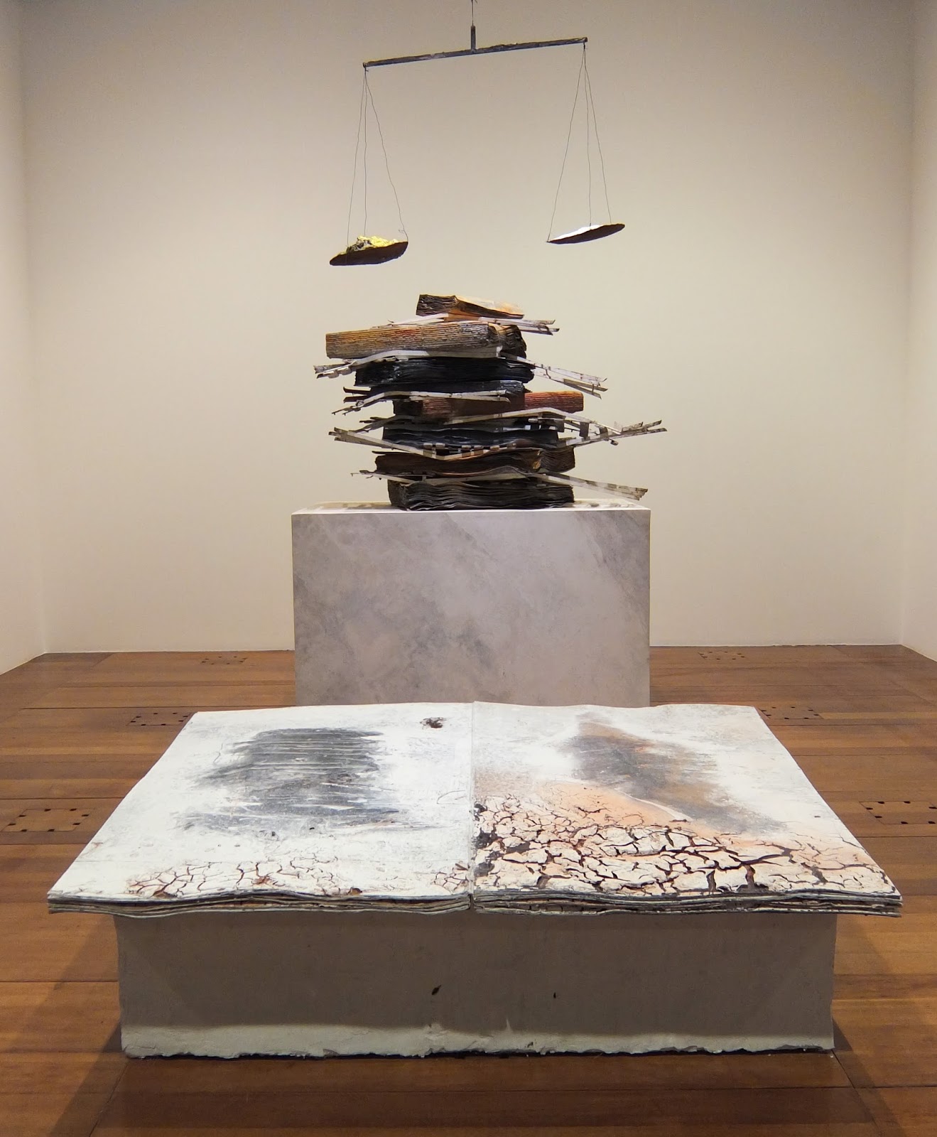
Installation view of 'Ton âge et mon âge et l'âge du monde', 2005 and 'Nigredo', 1998.

Recently I got chance to see a retrospective of Anselm Kiefer's book works at the megalithic Bibliothèque  Nationale François-Mitterand in Paris; a building that I love for its sheer audacity (how many other libraries have a wood planted right in the middle of them?).

Library Exterior.
During the course of my studies I'd heard a lot about Kiefer's books, particularly in relation to their earthy, organic qualities. And because books are often such small, intimate objects, I was keen to see the scale of the works.

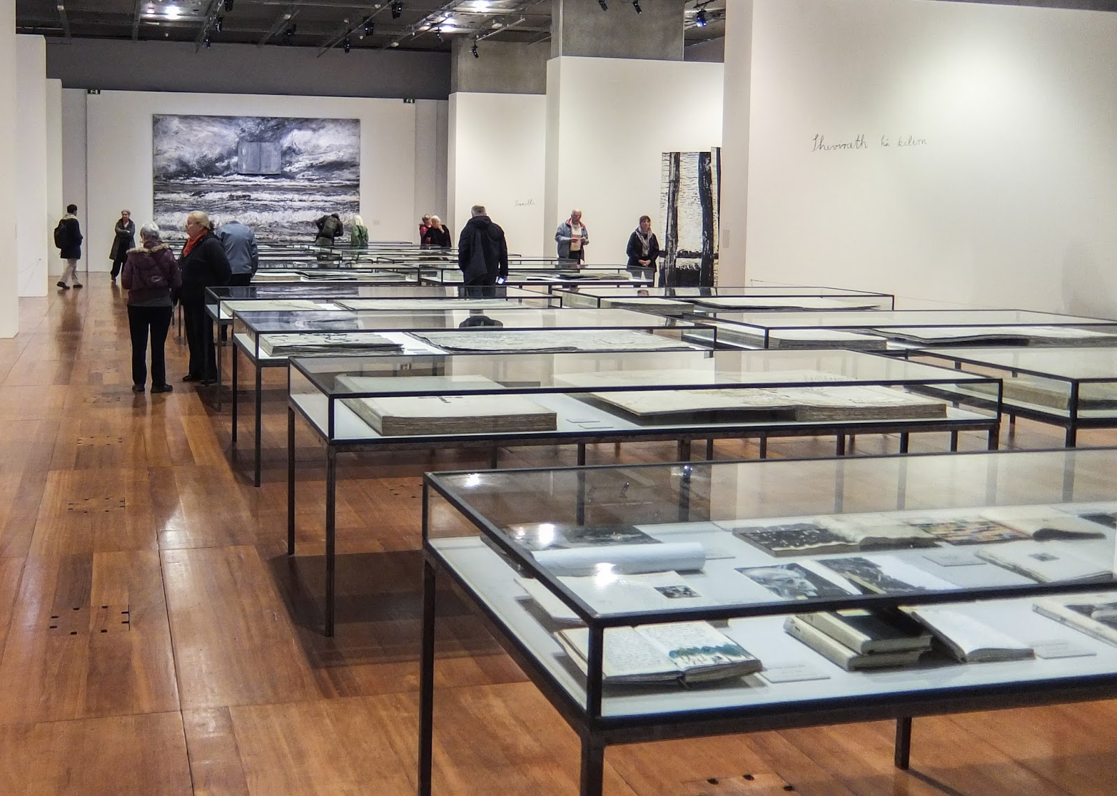
I have never seen an exhibition at the Bibliotheque National before, but the gallery was bigger than I expected. The room is made up of an open central space with vitrines of more traditional books and three alcoves on each side, housing the bigger, more physical books.


The first alcove on each side is called 'A Library Of Artists' Books' and have been made to look like archives with their utilitarian grey metal shelving. The shelves hold large (around 1m square) seemingly perfect-bound books. The thick pages have a quality of children's board books, but the content and construction is more akin to a sketch book or a journal. It is easy to imagine that each book is preparation for an artwork. Filed among these are boxes (presumably of books or loose-leaves), sculptural objects and vitrines. The effect is like a behind-the-scenes view of the artist's studio. The huge tomes have a real sense of gravity and even though they can't be read, these reading rooms are still immersive and contemplative spaces.

A Library of Artists Books, 2015

Subsequent alcoves feature large sculptural works - a particular favourite was the installation featuring 'Ton âge et mon âge et l'âge du monde' (2005) and 'Nigredo' (1998) (shown at the top of the page) as the balance between the organic and the bookish in the works seemed just right. Kiefer's work is confident and complex, but the familiar form and the earthy colours lend a warmth to it. This may also on part explain the artist's appeal to those on the Book Arts course I was on.

Le Livre, 2007 (detail)
 'Lichtung (Clairière)', 2015 (detail)
The front and back walls are flanked by large-scale, heavily layered paintings each of which incorporated a book form. I like the symbolic use of the book form within the composition, and although such a deep layering can make paintings very dense for me they certainly had a lot of energy and they enclosed the space very well.

In the vitrines down the middle of the room are a broad range of the artist's books. Many are open and although they can't be touched, the viewer is given a hint as to their contents. In an exhibition like this is not necessary to be able to handle these works, particularly as many are much closer to sculpture than an actual book.

'Les Reines de France', 1996 (detail)

Leaving the exhibition I was impressed with how prolific Kiefer is and how consistent his work is. I feel lucky to have had the chance to see the work and particularly in such a relevant context.

'The Alchemy of Books' continues until 7th February 2016.

[Chris]