Wednesday, 24 February 2016

Books Between Art and Science or Science and Art

Book exterior. Image source: Folia Water

A friend introduced me to this excellent project which aims to provide clean and safe drinking water to parts of the world that don't have access; the product is a book which contains advice and whose pages can be torn out to use as filters.

Book interior. Image source: Folia Water


According to the makers one page can filter water for up to a month and the entire book can filter water for a year.

Book as filter. Image source: Folia Water

I love the aesthetic of the book - the bound and embossed cover, the orange perforated pages with silver text. As this is a prototype, I wonder if the finished product would look dramatically different?

It is interesting that this book started as a scientific project, when it could have so easily been an art project - it's great to see how the two fields converge.

An example of the opposite - an artist whose work becomes scientific - could be Jamie Sholvin in his excellent project 'Various Arrangements' who used a mathematical formula to design covers for unreleased volumes of the iconic Fontana Modern Masters Book series.

Exhibition detail. Image source: Wire Frame

The project started when the artist noticed that ten forthcoming books were advertised but never released, so he created a loose formula to determine how the finished covers might look. 

Formula detail. Image source: Fontana Redux 

His 2012 exhibition at the Haunch of Venison exhibited his playful experiment and the book covers he has designed.

[Chris]

Wednesday, 17 February 2016

ATLAS


As I have only recently got back from holiday and I am still in the holiday spirit, it has inspired me to take a look at maps and guidebooks. As I have learnt from my holiday, the wisdom of others, in planning and mapping an area is a great help when you find yourself in an unfamiliar place. I have gathered together a selection of early examples of mapping as a way of tracing its history. 


__________


Claudius Ptolemy was a Greek scholar who lived in around 150 AD. Utilising the resources of the great library of Alexandria in Egypt he compiled a description of the world based on the writings of Greek astronomers, mathematicians and geographical writers of earlier centuries. The resulting book, the Geographia (also known as the Cosmographia) contained instructions on how to construct maps using projections to 'flatten' the image of the Earth and co-ordinates to place geographical features and towns. It is not known whether he actually drew any maps. The book never seems to have been well known in the western Roman empire and its text was completely lost following the Empire's fall late in the fifth century. There was some, but not much, knowledge of it in the eastern Empire. When a text, illustrated with maps, was brought to Rome shortly after 1400 and was translated into Latin, it caused a sensation. It paved the way for an entirely new, scientific, method of mapping and the text was much copied. This map comes from a copy of the Geographia that was created in northern Italy in about 1480. It looks very different from the form of the British Isles to be found on medieval world maps, on sea charts and on home-grown maps. The strange sharp rightward turn of Scotland is to be found on all Ptolemaic maps but was to disappear from the 'revised' or 'modern' Ptolemaic maps that were soon to appear. This map has, however, already been 'revised' in one significant way: it is drawn on a projection first thought up by Donus Nicolaus Germanus, a German monk who worked in Italy in the late 1400s. It closely resembles the first printed atlases of Ptolemaic maps. (www.bl.uk)


__________


Cristoforo Buondelmonti (1386 - c. 1430) was an Italian monk who traveled around greece. In 1414 he left his home city of Florence to travel the Aegean Islands. The Liber Insular Archipelagi (1420) above is one of the results of that. It contains a collection of geographical information, charts and sailing directions. 


__________


The first work to represent the first modern atlas was De Summa totius Orbis (1524–26) by the 16th-century Italian cartographer by Pietro Coppo. It contained a collection of systematic woodcut maps of uniform size.


__________

The word atlas dates from 1636, first in reference to the English translation of Atlas, sive cosmographicae meditationes de fabrica mundi (1585) by Flemish geographer Gerhardus Mercator, who might have been the first to use this word in this way. A picture of the Titan Atlas holding up the world appeared on the frontispiece of this and other early map collections. (www.wikipedia.org)


__________


Lastly I am going to end in the beginnings of a mapping system that we are more familiar with today. The Ordinance Survery. 

The name Ordnance Survey hints at how it all began. Britain’s mapping agency has its roots in military strategy: Mapping the Scottish Highlands following rebellion in 1745. Later, as the French Revolution rumbled on the other side of the English Channel, there were real fears the bloodshed may sweep across to our shores. So the government ordered its defence ministry of the time – the Board of Ordnance – to begin a survey of England’s vulnerable southern coasts. Until then, maps had lacked the detail required for moving troops and planning campaigns. (www.ordnancesurvey.co.uk)


The original draftsman's drawings for the area around St. Columb Major in Cornwall, made in 1810.


Wednesday, 10 February 2016

GUEST POST. Stepping away from Practices of Print: from Book to App (Zoë Aubugeau-Williams)


Minilab is a new digital production company created to deliver the most beautiful experiences in visual storytelling, learning and play that children can get their hands on.  Starting out as the digital R&D of Nobrow and Flying Eye Books, Minilab was set up as a new company in January of 2015 by Nobrow-co-founder Alex Spiro and digital creative James Wilson. At Minilab, we adopt the same basic values of great design of the highest quality that our sister companies are founded upon. We work with teams of talented animators and developers along with expert academics and the best illustrators in the world to ensure that we create the very best digital products for children that parents can rely on. We’ve recently released our first app, Professor Astro Cat’s Solar System.


 Professor Astro Cat first appeared in the book Professor Astro Cat’s Frontiers of Space, by illustrator Ben Newman and quantum physicist Dr Dominic Walliman. Professor Astro Cat and his friends act as a conduit to spread scientific fact in a fun way that children can enjoy. He wants to make learning fun because when done with love and humour, learning is easy.

It has become one of the best-selling books on the Flying Eye Books list, selling 90,00 copies worldwide, having been translated into 13 different languages! With Minilab’s intention to create beautiful, educational, digital content for children and with this proven track record behind it, Professor Astro Cat became the obvious candidate for this new project. James has a background in animation and had previously collaborated with Ben on the creation of animated GIFs of Professor Astro Cat, so it was definitely his first choice for a project too.


One of the earliest stipulations of the digital Astro Cat project was that, even if we were going to be covering similar educational content, the app should not be a straightforward conversion of the book. Astro Cat’s world and mission has been reimagined to create a brand new digital experience. There are plenty of ebooks and enhanced digital books out there that stick to the tropes and practices of print. The end result tends to look and feel like a glorified PDF, which is something that we really weren’t interested in. We thought that if we were going to develop a digital experience that started life as a book, we should offer something that a book can’t.


 When designing layout for a book, there is usually only one destination size. For example, in the book, the whole Solar System is shown across a double-page spread.
With an app, the design of the layout needs to be flexible enough to work across a whole range of devices ranging from squarer tablets to wider aspects found in smartphones and smaller devices. With the Solar System in the app, we get to see the planets up close whilst giving the user the understanding that there is more content ‘offstage’. The zoom function is a great example of playing to the strength of the format.


The app was built using Unity 3D, a powerful C# based platform that can run both 3D and 2D animations. Having the facility to use simple 3D models for the planets makes light work of conveying the planets spinning on their axes whilst maintaining the 2D flat aesthetic of Ben’s artwork. This adds another level of information to the illustrations in the book.

Breaking the page was very important. The digital app needs an anchor for all the information to move away and come back to. While a book is a more linear experience in which you physically go back and reference things, if you choose to. It was very interesting to adapt this because you have to design in a very different way. You need to think about what the viewer can’t yet see and how to take them there without the viewer feeling instructed.


Books are what we know and love. They can be wonderfully rich and accessible sources of information, entertainment and inspiration. With a Nobrow/Flying Eye Book we go as far as we can to to offer something that readers can’t get anywhere else.  In the Astro Cat book, we’ve presented educational content within a fully illustrated context, demonstrating the power of visuals to illuminate text in print. With mobile devices taking up ever-increasing amounts of eye-time and the devices themselves becoming more and more ubiquitous, the digital revolution is not letting up. Children are both drawn to and adept at this new technology and we want to make that screen time matter. It follows that with our digital offering we should be offering experiences that users can’t get anywhere else. Animation can add an extra element of life to visuals; animating Astro was a great way of expressing his character through motion. But digital experiences really come into their own when there are things a user can affect - making passive consumption OF MEDIA, active. So there’s lots to uncover, prod, swipe, read and also… play. By playing to the strengths of the digital format, we have allowed children to explore their own personalized, beautiful and educational adventure through space.


Zoë Aubugeau-Williams
www.nobrow.net
www.flyingeyebooks.com


Wednesday, 3 February 2016

→ in the gutter


At PAGES book fair in Leeds, March 5-6, we will be presenting GUTTER - our curatorial experiment, which is an investigation into the contextual presence of book as an object and as art object, as well as an investigation into a curated event as a paradigmatic structure. (do come and see for yourself what this sentence actually means!)


As a result, gutter is something I could not help but notice as we were selecting  entries for prescriptions medical humanities and book arts exhibition, due at Beaney House of Art and Knowledge in April later this year.

Here are a few of the artists and their works I have noted down for their use of gutter space.


Wounds by Ruth Shaw-Williams documents some of her mother's many scars left by years of surgery. Ruth is interested in the visual articulation of that which has been hidden.  This involves the archiving of past hurts, coupled with documentation of the point at which they re-surface.


Ashely Fitzgerald considers the idea of the book as if it was a body that came to life with the spine of the book as the back bone and the pages as layers of flesh. The work G.B.S.  addresses her experience with a viral infection called Guillane-Barre Syndrome.


When speaking about gutter it is only appropriate to talk about guts and on innards: a collaborative project between Amanda Couch, Andrew Hladky, Mindy Lee and Richard Nash, which explores the changing conceptualisations of guts and digestion, their impact on the creative process and the role they play in constructing and destabilising our sense of self. The book is very appropriately spilling out of it's encasement with more parts being added to it as the project develops.


Derek's Story by Josie Valley is based on a narrative provided by Derek Cummings. Josie has created a visual response that is empathetic to his expressions of the multimodal experience of chronic illness in contemporary society.


Wednesday, 27 January 2016

Editions of Alec Soth's Sleeping by the Mississippi


‘Gathered Leaves’ is a photography exhibition at the Media Space in London’s Science Museum featuring images by contemporary American photographer Alec Soth. The works, which represent four of the artist’s projects, are large in scale and have a documentary feel; representing marginalised people, places and aspects of modern American life. The title of the exhibition is drawn from a line in Walt Whitman’s ‘Song of Myself’; a poem which “explores the possibilities for communion between individuals”* - seen through this lens it’s hard not to feel emotional about the subject of the images, particularly the people that are caught within the frame.

It’s clear that books are important to the artist’s practice – they are included in the exhibition (in the form of traditionally bound publications, pamphlets and newspapers) and also the accompanying catalogue, which has a novel design, contains smaller publications within it. The artist has his own imprint: Little Brown Mushroom.

Catalogue Exterior. Image Source: MACK Books

Catalogue Interior featuring 4 smaller publications. Image Source: MACK Books

Of interest to me is the room devoted to the project 'Sleeping by the Mississippi' and in particular the small collection of books displayed in a vitrine at the beginning as they represent several ways of exhibiting the photographs. In the vitrine there are six books; 'From Here to There: Exhibition Notes' a guide to photos in the series, two handmade maquettes for 'Sleeping by the Mississippi' and three traditionally published editions.

Vitrine: Back View
Vitrine: Front View
The first book 'From Here to There' (2000, pictured below) contains images from the project, with descriptions - its content and utilitarian structure (spiral binding) give the suggestion that the book is purely functional - it is described as unpublished exhibition notes, so was likely made for personal use, or use by a gallery. The book is inkjet printed, giving it an unpolished, handmade quality.


Next to this is another simple, spiral-bound edition (2003) of ink-jet prints. The book includes the title of the project and there is a montage of photos on the cover. The montage gives the suggestion of narrative and hints at the idea of a journey. Could the artist be consciously using the book form as a means of exhibiting and curating the photographs (instead of just a means of documentation)?

Sleeping by the Mississippi, self-published, 2003, containing 43 ink-jet prints
Following this is a self published edition (above) in a brown, cloth-bound cover, featuring embossed gilt text and an inlaid image. The cover is simple and well-made and the inlaid photograph is evocative of the others in series. The attention to detail in this edition gives the project a sense of gravity - and the books finish makes it a very appealing object. The fact that the book is self-published (clearly at quite an expense) gives the suggestion that exhibiting the photographs in this medium was certainly a conscious decision.


Finally, included are three conventionally published hardback editions by Steidl (2004, 2004 and 2008) featuring 46 colour plates and essays by Patricia Hampl and Anne Wilkes Tucker. The first features a textured cover with an image of a faded wall where signs used to be tacked, the second a portrait and the third a grey cloth-cover with inlaid image, similar the brown, self-published edition.

The fact that the book has gone into its third edition suggests that the project is an incredibly popular one and being printed by such a prominent publisher and including essays by critics certainly gives the work legitimacy. For me these last editions are fairly conventional and therefore a little dryer - perhaps it is because they don't appear to reflect the hand of the maker in the same way as the first ones do. It makes me wonder whether this detachment makes the artwork inside less visceral? Instead of the publication being an artwork itself, it is more like a coffee-table book.

I think it is excellent to see the evolution of the books surrounded by the images on the gallery walls - it gives a suggestion of historical context and shows that an artist's work can be in a constant state of evolution. Each room within the exhibition contains vitrines with publications and each provides a different insight into the artist's practice.

The exhibition is on until 28th March 2016 the Media Space at London's Science Museum

[Chris]

*SparkNotes, Guide to Whitman's Poetry

Wednesday, 20 January 2016

TV on the BOOK

Recently I have become very interested in the representation of the tv screen in the book. Not only because one of our projects had led us there but I have had a couple of books pop up which have explored this. One I have read and one that I have seen, they are both very beautiful in terms of design and aesthetic. In exploring structure, time and space the book functions much the same as video does although it has a slightly random and non linear one based on the choice of the reader. 

The fist book I am going to look at is a project that we have been working on. 

reading the book as an object - collective investigations

This book originated as a film as a book. Where the film takes the structure of the book. The screen divided into two ‘pages’ recreates a visual similarity with the open spread. With this framework the film slipped nicely back into the book form. It was interesting to see the volume the film took up when this was done. A screen capture was taken every second of a three minute film. The physical weight of the film is represented in the book  

Alice’s Adventures in Wonderland - and Through the Looking Glass

This book I came across quite recently and is quite a fun example of how you can portray a film within a book. The book being one that already exists in a literature sense has been adapted for film. Like our project this film adaption finds itself back in the book. Though this time it is a frame by frame analysis done in line drawings with text. These are interspersed with photos of the cast. Whats on screen is interpreted for a printed book and layered with the bookish elements of text.


Between Time and Timbuktu - Kurt Vonnegut

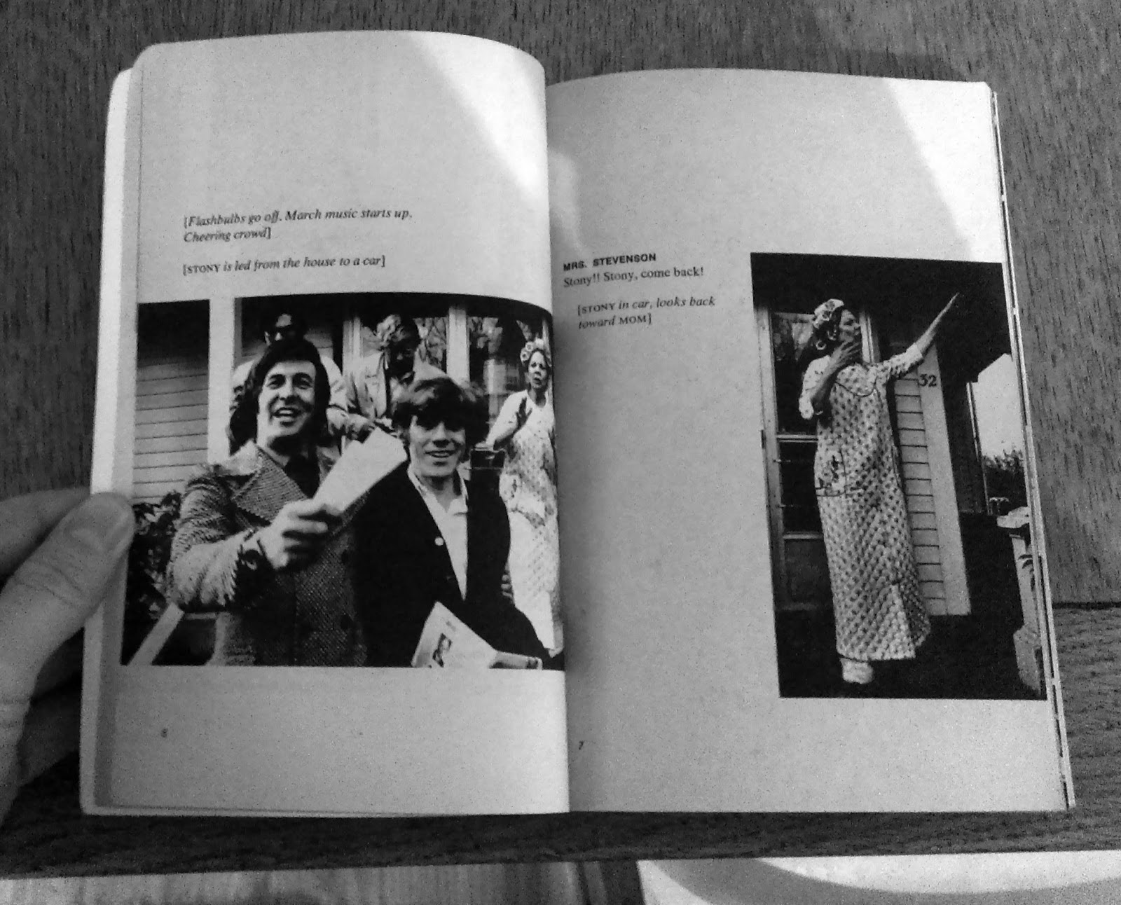
One of my favourite authors Kurt Vonnegut wrote a television film in 1972. The film was published as a book in the same year. The script is published along with stills and photos from the film. When I discovered this book I had a sense of pure delight. Not only because I enjoy his work but the simplicity and clarity of the design gives it a graphic novel feel. It is a great study in how image and text can work together. It is not a pure representation of what happened on the screen in the way that reading the book as an object is. It supplements the TV with the quality of the book. That of the story. Presented as a script, you can read it as a novel but it retains that immediacy of TV. It is TV slowed down, TV that goes at your own pace.


Wednesday, 13 January 2016

GUEST POST: The concertina. The accordion. The oriental fold. (Erin K. Schmidt)


The concertina sets itself apart from other book structures in its distinctive form of repetitive folds which allows a versatility in presentation and viewing. The variation in physical space that a concertina book can create and occupy creates a shifting relationship between content and form. The folded pages can be held together on one end and turned like those of a codex between the covers, politely requiring very little space. When the concertina behaves like a codex it allows only a fragment of the content to be visible at any given time.

The pages of a concertina can also spill out beyond those borders of the cover, boasting the content within the book. When the pages of the concertina are extended, the contents on each side are displayed all at once allowing the viewer to engage with the contents in its entirety.


The folds allow the book to harness and capture space, to create an enclosed environment with the slightest manipulation of the page, or to fully extend and occupy as much space as possible. Shadows are created within the space, deeper and darker with the closeness of page; light and airy upon opening. These shadows are part of the play of the book and its content, and can, with subtle movement, affect the overall tone of the work.


In my book the house in the wood I have placed two concertinas within the hardcover such that the cover closes and presents itself as a codex with the spine on the left. Because of this cover, the book can readily be viewed as codex, turning the pages as such to read the text without having to hold them together at the left.


The book can also be opened wide to allow the concertinas that have been nestled within the cover to spread out and expand. When extended, the two concertinas reveal their backsides which contain multiple images of small mushrooms. Because of the folds in the concertinas, the pages can be manipulated and moved to various positions for viewing. The space that is created between the concertinas becomes an extension of the forest floor connecting the images to each other.


I chose this format of using two concertinas for house in the wood which extend in different directions to correspond with the text of the book which describes the two paths that lead the viewer away from the house and into the forest. As the paths bend and wind, the concertina folds allow the paper to be manipulated similarly.


For my book tea and water pipe, I’ve chosen to use a double concertina. The doubling of the concertina creates a physical space between the layers, as well as the space that the structure itself already occupies due to the nature of its folds and shape. When the book is open and extended the structure becomes the setting of the book, a tea house in which the narrative occurs.


I have placed the text on the interior pages such that it can only be viewed by looking through the lattice windows that have been cut into the front layer of the concertina. In this way the viewer must enter the work as a voyeur peering into the space from the outside. The outer concertina creates a physical barrier between the viewer and the text, a private lament for a departed friend, some of the thoughts so quiet the words are barely visible.


The concertina is a dynamic marriage of content and structure. The flexibility of the book requires a flexibility of content. I consider this when I choose to use the concertina structure in my work. The content must work when viewed in fragments as well as when viewed as a whole. The interplay of shadow and form should complement the content, and vice versa. The folded pages will create small, private spaces for the viewer to dwell, whether in shadow or light. It is important, within these spaces, to offer a quiet moment of intimacy that the viewer may share with the book.


More concertina books by Schmidt:

Lament
Long Blond  Hair
Muse
God Save the Queen


Erin K. Schmidt is an American artist, whose artwork is heavily influenced by notions of identity created through personal histories, memories, and perceptions. Her books focus on brief moments, punctuated by repeated imagery or text, recalling intimate events or memories. She uses private photos and writing within a variety of structures and media to evoke emotions. She earned her BFA from Michigan State University and her MA in Book Arts from University of the Arts London. She has been awarded Shefield International Artist’s Book Prize in 2014. Her work has been exhibited internationally and can be found in private and public collections including Tate Britain, London, UK; Saison Poetry Library, London, UK; University of California San Diego;  RISD.