Wednesday 30 December 2015

Happy New Year from Collective Investigations

New Year is always a time for reflection and recently I was thinking about the books we give people at this time of year. Among the biographies and cook books, shop windows and supermarket shelves are often filled with annuals, mostly aimed at children and tied in with comics and TV shows. I wondered about their origins and was surprised to learn that the precursor to these books dates from 1823. It was a publication called Forget me Not, intended to be given to mark Christmas and the New Year.


The publication was filled with engravings accompanied by commissioned poems and stories. The publication launched a host of other such books which were popular right up to the mid-century, at which point production standards and subsequently readership began to decline.


I wonder if the genre will still be around in another 200 years? It would be fascinating to know. As we live in such fast moving times, it seems like anything is possible.

Warm wishes from us for the 2016 - we hope it is a happy and productive New Year.


Chris, Egidija and George


Image credits: Interior Image and Covers.

Wednesday 23 December 2015

Wednesday 16 December 2015

→ EDITION SIZE UNKNOWN (making sense of editioning artists' books)

ABOUT STONES, an unnumbered edition of 51


This blog post is a private contemplation, as I try to make sense of editioning. 
Remarks and comments on the subject are very welcome.


Everyone producing artists' books seems to have their own process and rules of editioning. Most of the time, I mark and sign edition on the back, and then - discreetly in the gutter - I keep the information on the print run, the paper, the printer and the ink and any other speciffication which I may find important. Like most of us, I try to print all of the edition at once. It is not always practical, however - frequently, I do not have the facility to store large amount of books. If I do not print the edition in one run, can it still be considered the same edition? Can it be numbered as the same edition if it was printed in three runs six months apart using the same printer? The same bed of type? A different printer or different bed of type in a different location? How do you mark those differences? Is it important to mark them?

The business of editioning artist's books sits between producing and numbering books as fine art multiples and producing artist's books as publications. Each of those areas is governed by the absence of formal rules(1), which leave all of us to our own devices of how and when we number our works.


FINE ART (prints)

In printmaking, as Wikipedia says,  "an edition is a number of prints struck from one plate, usually at the same time. This may be a limited edition, with a fixed number of impressions produced on the understanding that no further impressions (copies) will be produced later, or an open edition limited only by the number that can be sold or produced before the plate wears."

In digital printing, "dating digital images is particularly important. Since a digital file prints out exactly the same way every time you print it, no matter when you print it, the quickest and simplest way to differentiate one image from the next is by the date it was printed. Even though a print may be one of a larger edition, a date individualizes it, and makes it just a little bit more unique. And buyers like that. In fact, buyers generally like dated art, especially when their dates precede other buyers' dates." (Giclee Printing and Pricing for Artist Limited Editions)

Fine art prints also allow for an artists' proof to exist (marked as AP) outside the edition. Classically, 10% of a limited edition size is considered an appropriate amount of artists proofs (Editioned Prints and Photographs).


(Then there is fine art ephemera, which is a different kettle of fish - see further below.)
 

Fine art (printmaking) environment has the figure of buyer-collector in the picture. Art buyers like to know the size of the edition. Art buyers like low numbers. Art buyers like signatures. Also, as it turns out, art buyers like digital images to be dated.


PUBLISHING

Bibliographical definition of an edition was given by Fredson Bowers in Principles of Bibliographical Description (1949). Bowers wrote that an edition is “the whole number of copies printed at any time or times from substantially the same setting of type-pages,” including “all issues and variant states existing within its basic type-setting, as well as all impressions.”  Collectors, however, would only consider the first print run as the first edition, while publishers each have their own rules.

A wonderful book First Editions of To-day and how to Tell Them (1929)(2) by H.S.Boutell gives some fascinating insight into the issues of editioning and terminology used, some of which, is still very relevant today.

        Generally speaking, the collector of first editions is really a collector of first impressions, a first impression being a book from the first lot struck off the presses, and a first edition comprising all books which remain the same in content and in format as the first impression. A second impression is a second printing, A second edition postulates some alteration of text or format. But these terms are, unfortunately, not strictly adhered to. (Introductory Note by Boutell)   

In the Publisher's Note Boutell further points to Arrowsmith entry on page 12, where they note that "the correct term not First Edition but First Impression or Issue." Boutell regrets that the error of terminology is almost universal.


(Can a digital print run be still called an impression?)
 
The rest of 62 page book is filled with publishers' responses to how they mark their first and subsequent editions and impressions. The book shows how varied the practice can be! For example, I used the book trying to track down the edition number for my The Poetical Works of John Milton (1898) published by Frederic Warne and Co., only to find out that they did at one time mark first editions with a private mark, but they had discontinued the habit and they had even lost trace of private marks (p38).
 

Bibliographical/book-collector context brings forward the importance of differentiating between the edition and the print run. 


Editioning information of Alice in the Wonderland (1929) published by George G. Harrap & Co., LTD.
Editioning information of Tractatus Logico-Philisophicus (2009) published by Routledge Classics.


EDITION SIZE UNKNOWN?

Artists' books include not just bound books, but also a wide range of ephemera in the form of posters, postcards, leaflets, pamphlets, periodicals, zines, fanzines, bookmarks, maps, graphs, tickets, invitations, etc., which may come as multiples, but may not always be numbered. Some will be produced on site to serve as an evidence or a continuation of another event. Others will be regularly published. Among the more fascinating cases of ephemera are Fluxus score sheets.
"Produced throughout the 1960s and 70s, they take on a variety of forms from small event cards with text prompting the viewer to perform everyday actions to larger graphic scores with abstract compositions for indeterminate musical and dance performances." (Exhibiting Fluxus: Keeping Score in Tokyo 1955–1970: A New Avant-Garde) Many of those scores were published and disseminated by Maciunas as Fluxus editions, multiples stamped “© Fluxus”. They could be purchased at low costs. Here are three catalogue entries for three Fluxus publications:


CONCLUSIONS
 

The concept of editioning is tied down to the place and time of production and it benefits the collector/buyer to make judgement on the value of the artists' publication.
 

Is it important to keep editioning consistent? In the tradition of artists' book as an editioned work of print, the publication benefits from showing all of the information mentioned above as an honest statement about the scale of production. However, the artists' intention might be that the publication is infinite and ephemeral. In that case, it is up to the collector and cataloguer to make sense of it's editioning data.


NOTES:

(1)  New York and California consumer protection laws require a certificate of authenticity when selling artist multiples.
http://artlawjournal.com/art-dealers-full-disclosures-selling-multiples/
https://news.artnet.com/market/buying-and-selling-art-in-multiples-323824


(2) First Editions of To-day and how to Tell Them (1929) by H.S.Boutell was purchased from Barter Books in Alnwick. If in Northumberland, it is always worth a trip to this  
Ghibli-esque emporium of second hand books.

[Egidija]


Wednesday 9 December 2015

GUEST POST: SENSES CHANGES MINDS MOVES - ARABESK (Randi Strand)


ARABESK – a series of books made in relief print and hand-cut stencils on 11-12 grams Japanese paper. Each book has 4 – 7 sheets. The paper and the ink is so transparent that you always see something of each sheet. The books have black covers. Edition of 1 to 5. Year 2014- 15.
Here you see images of ’Arabesk 12’.


The paper is translucent, soft, airy, and completely silent. Quick movements of the papers is physically impossible. Each sheet has one visual element, a shape which is mirrored as you turn the page.


The fragile paper is printed with motives developed from Arabic ornamentation. This expression was originally created out of mathematics and geometry, to avoid imagery that might lead to idolatry. I wanted to combine the book as a system, with this geometry to see what that could bring. I find it fascinating how the images switch between flat and spatial, and that despite the strict patterns, associations may vary and go towards modernism, the oriental, and paradoxically also towards figuration.


The transparency causes overlaps between the pages that create new shapes and new colors. The sheets melt together in a way which makes it almost impossible for the reader to predict the next sheet’s exact pattern and color, or to remember precisely the last motif. It plays with the illusions of form, color, space and order. The image is transformed with each turn of a page and becomes ephemeral.


A book starts to exist the moment its pages are turned. Since the book is a media of intimacy, presence and touch, haptic communication inevitably establishes meaning in itself, a communication which invariably will be in some kind of relation to the mental content. It is an arena where perception and thinking operate together, it might also bring awareness of your own perception.


Books have been holy objects for many different reasons. The fragility of the paper and the actions necessary, may add a ritualistic element to the act of reading. I see the reader’ act as a performance, a slow motion ballet. In a materialistic culture of mass consumption and noisy, offensive expressions, I find it appropriate to react by focussing on tranquility, care, and consideration.


Like mandalas, which often are written in sand to be washed away, I have tried to create a space for a contemplative experience, displaying the ever changing character and relativeness of existence, where different elements always are colored and influenced by their surroundings.


One time based media can express another; see a slow motion page-turner, a real interactive media by clicking:


Arabesk 4: https://www.youtube.com/watch?v=Vzpw99bqKRo
Arabesk 9: https://www.youtube.com/watch?v=YnzaAkFcEIs
Arabesk 12: https://www.youtube.com/watch?v=4yYLoLW66w8


www.randistrand.no


Randi Annie Strand, visual artist, born in Norway 1962. Lives in Oslo. MA from Bergen Academy of Art and Design (92). Language, signs and sensory experiences are central elements in her works. Her ideas has been realised through different media and techniques. She has had many solo- and group exhibitions in Norway as well as abroad. Purchased by The National Museum, KODE Art Museum among others.


Wednesday 2 December 2015

Exhibition: Anselm Kiefer, 'L’alchimie du livre / The Alchemy of Books' at La Bibliothèque nationale de France

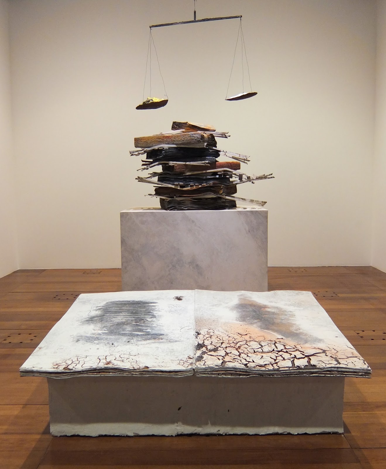
Installation view of 'Ton âge et mon âge et l'âge du monde', 2005 and 'Nigredo', 1998.

Recently I got chance to see a retrospective of Anselm Kiefer's book works at the megalithic Bibliothèque  Nationale François-Mitterand in Paris; a building that I love for its sheer audacity (how many other libraries have a wood planted right in the middle of them?).

Library Exterior.
During the course of my studies I'd heard a lot about Kiefer's books, particularly in relation to their earthy, organic qualities. And because books are often such small, intimate objects, I was keen to see the scale of the works.

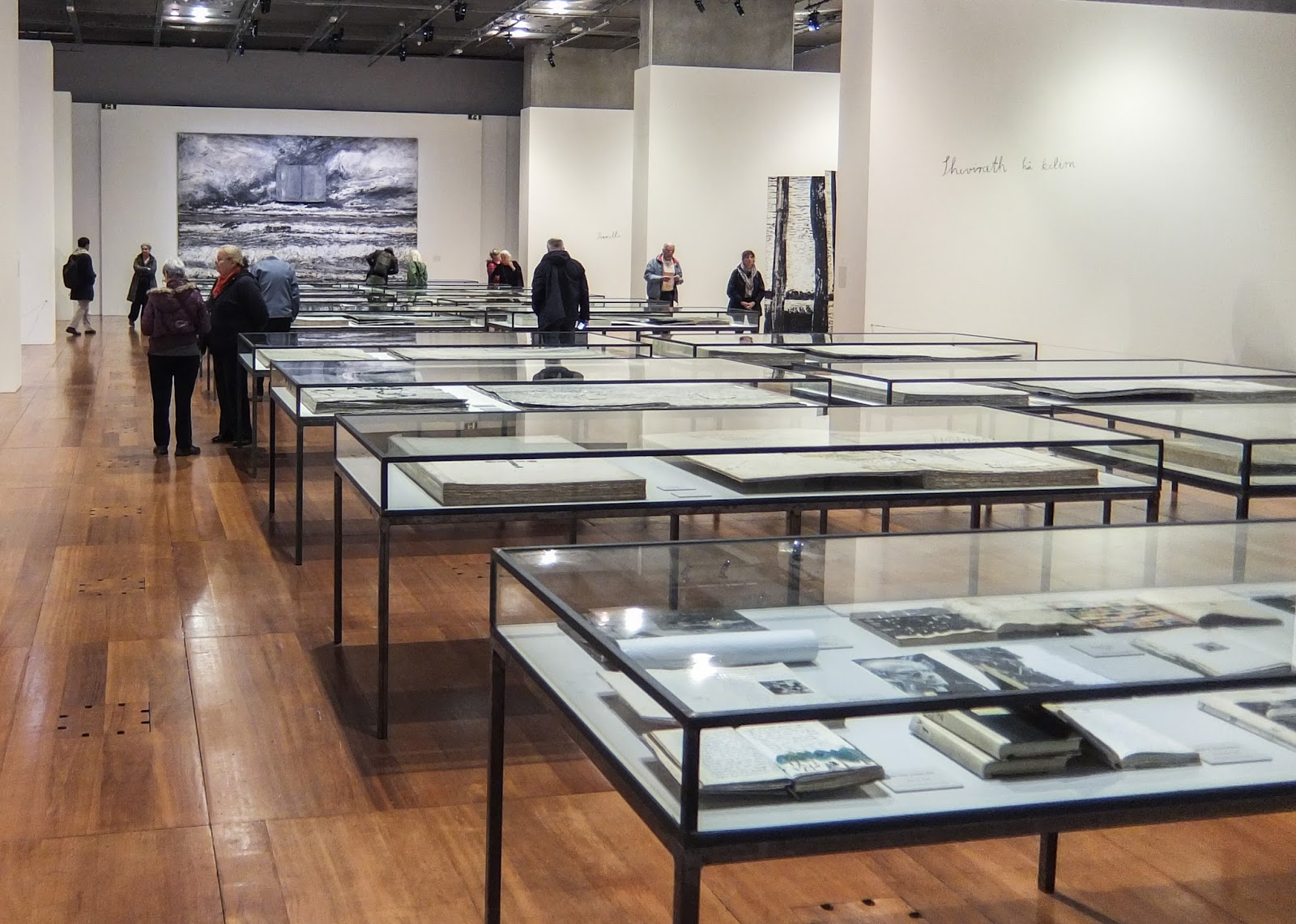
I have never seen an exhibition at the Bibliotheque National before, but the gallery was bigger than I expected. The room is made up of an open central space with vitrines of more traditional books and three alcoves on each side, housing the bigger, more physical books.


The first alcove on each side is called 'A Library Of Artists' Books' and have been made to look like archives with their utilitarian grey metal shelving. The shelves hold large (around 1m square) seemingly perfect-bound books. The thick pages have a quality of children's board books, but the content and construction is more akin to a sketch book or a journal. It is easy to imagine that each book is preparation for an artwork. Filed among these are boxes (presumably of books or loose-leaves), sculptural objects and vitrines. The effect is like a behind-the-scenes view of the artist's studio. The huge tomes have a real sense of gravity and even though they can't be read, these reading rooms are still immersive and contemplative spaces.

A Library of Artists Books, 2015

Subsequent alcoves feature large sculptural works - a particular favourite was the installation featuring 'Ton âge et mon âge et l'âge du monde' (2005) and 'Nigredo' (1998) (shown at the top of the page) as the balance between the organic and the bookish in the works seemed just right. Kiefer's work is confident and complex, but the familiar form and the earthy colours lend a warmth to it. This may also on part explain the artist's appeal to those on the Book Arts course I was on.

Le Livre, 2007 (detail)
 'Lichtung (Clairière)', 2015 (detail)
The front and back walls are flanked by large-scale, heavily layered paintings each of which incorporated a book form. I like the symbolic use of the book form within the composition, and although such a deep layering can make paintings very dense for me they certainly had a lot of energy and they enclosed the space very well.

In the vitrines down the middle of the room are a broad range of the artist's books. Many are open and although they can't be touched, the viewer is given a hint as to their contents. In an exhibition like this is not necessary to be able to handle these works, particularly as many are much closer to sculpture than an actual book.

'Les Reines de France', 1996 (detail)

Leaving the exhibition I was impressed with how prolific Kiefer is and how consistent his work is. I feel lucky to have had the chance to see the work and particularly in such a relevant context.

'The Alchemy of Books' continues until 7th February 2016.

[Chris]

Wednesday 25 November 2015

the web within a book the book within a web

Recently we have been asked by the British Library to submit our site http://collectiveinvestigations.tumblr.com for the http://www.webarchive.org.uk/. This has got me thinking about how the internet has a vast wealth of data that a library could potentially collect. They currently hold 14,929 websites represeting 27.48TB of data which is a small portion of the 957,324,487 websites that are currently on the internet. (http://www.internetlivestats.com

‘The UK Web Archive contains websites that publish research, that reflect the diversity of lives, interests and activities throughout the UK, and demonstrate web innovation. This includes "grey literature" sites: those that carry briefings, reports, policy statements, and other ephemeral but significant forms of information. Because websites are revisited and snapshots ("instances") taken at regular intervals, readers can see how a website evolves over time. The archive is free to view, accessed directly from the Web itself and, since archiving began in 2004, has collected thousands of websites.’ (http://www.webarchive.org.uk/)

It is interesting how the the websites are given book like qualities. Collected by a library and presented to readers, in much the same way they would collect and catalogue a book. 

_

I have been looking at some artists and projects that explore this notion of collecting and the place the internet and the library have in relation to this. 


One of them being Chris Gibson from our collective with his work the Unassuming Collection. 


The book holds within it links to books that can be read online. Using the form of the book to collect and present these other books. The book becomes a library. A library of texts that sits between both an online collection and a physical one.


the unassuming collection - Chris Gibson
‘The Unassuming Collection is a paperback comprised of double-page spreads, featuring a disjointed but unfolding narrative on the left hand and a visual fragment (marginalia, an image, isolated text) taken from an existing book, on the right. The story refers to an imaginary library, but the images are taken from existing books. Below the right hand text is a QR code leading to a location where the book can be borrowed online, turning the fictional collection into an actual one.
The artwork emphasises the book’s role as archive – or keeper much more than its pages belie.’ (http://chrisgibsonart.blogspot.co.uk/2014/05/in-progress-unassuming-collection.html)

Another project I have come across is the Library of the Printed Web. http://libraryoftheprintedweb.tumblr.com

Library of the Printed Web is a physical archive and Tumblr devoted to web-to-print artists’ books, zines and other printout matter. It is also the publisher of Printed Web. Founded by Paul Soulellis in 2013, Library of the Printed Web is “web culture articulated as printed artifact,” characterized as an “accumulation of accumulations,” much of it printed on demand. It has also been described as an archive of archives. Techniques for appropriating web content used by artists in the collection include grabbing, hunting, scraping and performing, detailed by Soulellis in “Search, Compile, Publish,” and later referenced by Alessandro Ludovico.

They have collected together a lot of really interesting projects that like Chris’ book straddle that physical/digital divide. 


Experimental Publishing Studio at Rhode Island School of Design, COOKING WITH DOG, a one-hour Google doc book. With Jordan Hu, Drew Litowitz, Jane Long, Zhurong Qian, Francesca Capone, Mina Park, Stephanie Low, Ming Zhen, Lizzy Lim, Gyu Won Lee, Julie Rhee, Yoo Jin Jang. Spring 2015.


Mishka Henner, _IMG01 Australian-troops-passing-014.jpg. Self-published, PoD, 2014. Edition of 97 signed books and a 5x7 silver gelatin print. 740 pages.


Wednesday 18 November 2015

→ books in cyanotype


BOOK No1

Some weeks ago - just in time for the World Photobook Day - I discovered Anna Atkins' 1841 cyanotypes for the Manual of British Algae: the first book to be photographically printed and illustrated. A copy of this book is kept at Horniman Museum in South London.

(both images from Horniman Museum)
Anna Atkins' prints were "photogenic drawings"(1), as she called them. Cyanotype process offered her an image reproduction technique, which escaped the need for accurate drawings. Blue background suggestive of the sea lent poetic beauty to her images of sea plants. While Atkins famously failed on scientific accuracy, she succeeded in producing an very elegant photo book.


BOOK No2


Last year's MA Visual Arts (Book Arts) show at Camberwell College of Arts featured works by Ziyan Lu -  Unfolding Shaddow. Lu printed by setting up paper in various public locations; then impressing poetics of the flowing time into her books: abstract images were produced by the passing shadows from the objects around.


 BOOK No3

Christian Marclay is a New York based visual artist and composer whose innovative work explores the juxtaposition between sound recording, photography, video and film. In 2011, he published Cyanotypes, for which he used drawings of unwound the spools of old cassette tapes. Often using multiple exposures, Marclay created a labyrinth of lines, all tracing a distinct musical history that becomes abstracted, or at least estranged, on paper.


(images from GRAPHICSTUDIO)


 BOOK No4

In 2011 Ellen Ziegler produced an  artists' book, as she was grieving a sudden loss of her boyfriend. "Imbue” is a sheaf of abstract chemically-altered cyanotype prints inscribed with a crow-quill pen, the words chemically bleached out of the deep blue background. The poems by Patti Smith & Frances McCue reach the sorrowing depths of beautiful and ferocious grief.


(images from Ellen Ziegler website)

AND A BLOG

Vedos Project at Satakunta University of Applied Sciences / School of Fine Art Kankaanpää in Finland unites artists and teachers interested in studying and practising alternative printing processes in photography and printmaking. Their very informative webpage gives a fascinating insight into the processes, including paper and tinting tests.

(images from Vedos Project)


(1) Henisch, Heinz (1994) The Photographic Experience, 1839-1914: Images and Attitudes, University Park, Pa. : Pennsylvania State University Press. p317.


Wednesday 11 November 2015

GUEST POST. David Bomberg’s "Russian Ballet": a new beginning for English artist’s books? (Richard Price)


When David Bomberg published his slim artist’s book Russian Ballet in 1919 he was saying a fond farewell to the abstraction he had developed before the First World War.

Here was a booklet developed from sketches he had made before the War, using printing skills he had learned at that time, too.


The cover of Russian Ballet. The lettering is astonishingly ahead of its time: more 1960s
than 1919, and the large, all-capitals title, as well as the use of the artist’s surname (only), at a
perpendicular to the title, has a swagger, challenging conventional notions of ballet and asserting
the artist’s authority. (Image source: Wikipedia.
https://en.wikipedia.org/wiki/File:RussianBalletBomberg.jpg)


It is as abstract as anything he had produced in those Cubist-inspired days but it is not a ‘resumption of normal service’: he would soon entirely change direction, painting recognisablelandscapes and cityscapes pretty much for the rest of his life.


An image from Russian Ballet, c.1914/1919. As well as incorporating images into the artist’s
book, Bomberg seems to have made the lithographs available separately, as here. (
Image source: ©Tate,
used here for strictly non-commercial purposes. http://www.tate.org.uk/art/artworks/bomberg-vip07013/text-catalogue-entry)


There are many reasons why he might want quietly to assert the abstraction of what must have seemed like a bygone era, just five years ago. 

 
An independent artist rather than working through a movement or school, he had nevertheless flourished in the pre-War company of various kinds of literary and artistic avant-garde, admired by but at armslength from Wyndham Lewis’s Vorticists, and part of a loose grouping of men and women associated with Whitechapel, London.

It wasn’t just that he had been so excited by Sergei Dhiagelev’s company Ballets Russes, whose modern approach to dance had created such a sensation when it came to London in 1911. Other artists, such as August Macke, had also been stimulated by what they saw (in Macke’s case, seeing the ballet in Paris).


Ballets Russes, by August Macke, 1912. Macke’s post-impressionist style shares the same rich
aubergine palleteBomberg would adopt, a testament to the velvety light of the theatrical
appearance, and asserts, too, the important role of the audience in the overall experience. Bomberg
differs by moving firmly into abstraction. (Image out of copyright.
Image source:
https://en.wikipedia.org/wiki/Ballets_Russes#/media/File:Macke_Russisches_Ballett_1.jpg)


The excitement was as much about possibilities of response as it was about new subjects. Remembering the exhilaration of finding new ways to praise, to affirm, of finding new ways to pattern celebration –Bomberg must have made Russian Balletfeeling all kinds of complicated nostalgia,including nostalgia for the idea of the good future. Russian Ballet even continues a theme he had addressed in bookform before the War: in 1914 he had provided a dancing image for the cover of Poems by the modernist John Rodker.
 

There had been so much loss since then. He had been at the Front and had seen the slaughter. Not a natural poet, he had yet been driven to write poems which tried to grasp the horror of the scenes he witnessed (these few poems would not be discovered until nearly the end of the twentieth century and contain some of the most violently explicit war poetry in English). Some of his friends, such as the artist and poet Isaac Rosenberg, had been killed in the War. He had suffered a devastating artistic shock, too, when, as an official war artist, the commission he had madehad been rejected by his paymasters, its anger and its relative abstraction surely the reason.


Caption: Further images from Russian Ballet, c.1914/1919. Image source: ©Tate, used here strictly for non-commercial purposes.
http://www.tate.org.uk/art/artworks/bomberg-iii-p07010


So this physically light-weight book, Russian Ballet, a pamphlet really, has far more emotional freight than its fragile frame suggests. Dance and in fact the human body are like that: people carry a density of experience which renders flat; in comparison to the emotional volume, presents weightless.


I think Russian Ballet is also one of the modern beginnings of the English artist’s book. The pamphlet form is part of this. You could say that one tradition Russian Ballet counters – though there are too many tributaries of the English artist’s book tradition to go into here – is that of the literally heavy religious work. The Lindisfarne Gospels is the prime example in its large lavishness, its huge, physical, sculptural presence. True, the stolidity of its scriptural ‘republication’ of the Gospels is set against the freer improvisations of its beautiful visual decoration, but Russian Ballet takes such abstraction and separates it entire. Figuratively speaking, the Gospels tries to ground its readers, but Russian Ballet encourages them to take to the air.


One of the ways it does this is by using a single, short, text and eking that text out across the whole book. The poem starts with an artistic explosion – “Methodic discord startles” - which is nevertheless described in distanced language, so that we don’t know exactly what is being disrupted and we also feel that a commentary is being made rather than a closer, realistic sally into whatever is actually happening. This strange relationship between an intellectualisation and an experience is maintained all through the book, and is in fact one thing that abstraction is: you may feel closer to the essence of something by being able to understand its reduced but heightened metanature, you come round to what you may think is essence by disengaging to a great degree from specific reality. 


Because each line of poetry is given a whole page to itself, the book emphasises either a contemplative role for the textor a speeding up of reading (the reader can decide). In the first interpretation the exposed short text slows the reader down: the page is saying, “dwell on this, I have place this sentence amid so much white-space in the way that I have placed a visual work on the other side of the opening”. Yet the whole book is about movement, the fast movement of dancers: in the early days of cinema Bomberg is giving us a slow motion effect while foregrounding the dilemma visual and literary art has in
the depiction of movement. The line that the book and poem conclude with – “The mind clamped fast captures only a fragment, for new illusion” – suggests that velocity, admitting that there cannot be a totality of interpretation, is also the book’s theme.


The language is highly unusual for the poetry of the day. It asserts unashamedly a place for theoretical observation in poetry, and yet places a premium on concision: a six line poem becomes a whole book. 


Finally, Russian Ballet was one of the places where poetry and art were joined in physical performance, in theatre of a new kind. It is recounted by Bomberg’s biographer Richard Cork that David Bomberg and his then wife Alice Mayes pretended to be programme-sellers at an actual performance by Ballets Russes, selling Russian Ballet to unwitting attendees of the Ballet. Diaghilev, who was present at the performance, discovered the ruse and apparentlymade the buyers return their books. However, this was not before Bomberg had placed himself in the history of the arts as an innovator in no less than
three fields – the artist’s book, English poetry, and performance art.


There are a number of digitised versions of Russian Ballet available on the net, and free to use under US copyright law. Because of restrictions elsewhere, we have avoided directly linking to those, but draw readers attention to their existence. Of course, for artist’s books, it is usually better to experience them in person. In the UK, libraries which hold Russian Ballet include Birmingham University, The British Library, The V&A, the National Library of Scotland, the National Library of Wales, and the Tate Library (Tate Britain).


References:
John Rodker, Poems, London: [Privately Printed], 1914.
David Bomberg, Russian Ballet (London: Hendersons, 1919).
Richard Cork, David Bomberg (New Haven: Yale University Press, 1987). See
especially: pp.122-126.


Coda

 
How a book could be 

by Richard Price
Bomberg’s Russian Ballet, 1919


This is how a book could be –
tonight it’s ballet, tomorrow
apply a different progression code
within the hyper lex transfer protocol.


There’ll be a future name for a flicker render, mimicking film.
It’s fine, you can theorise in poetry,
sing analysis in. There’s lyric in the language of the intellect –
lyric can be intelligent, breathing out a thought, attentive adoration.


This is how a page could be –
mostly whitespace for the text wall, and the windows varying in size, varied in
shape,
colour saturation, force of light.


It is all dancing and stage-build today, rich reds by design,
but you can still cherish resolving in the eye / hands.


Tomorrow this is how pauses work


This is how ellipses…
and now dashes –


           positioning, movement
                                         and you make it all a performance –
Would you like to buy this programme?


(The contents resemble everything I once wanted, worked for, resemble…
nothing you could have seen before,


                                                              and now they’re all alight.)


Richard Price’s poetry collections include Lucky Day, Rays, and Small World. He has collaborated with the artists Ron King, Karen Bleitz, Julie Johnstone and Caroline Isgar on various artist’s books. He is Head of Contemporary British Collections at the British Library. More information about his work is gathered at www.hydrohotel.net