Showing posts with label book: digital. Show all posts

Wednesday, 20 April 2016

The Complete Virginia Woolf - an eBook as a labour of love

Although I’ve changed ebook-readers a few times over the years, one book that has remained ‘constantly’ on my virtual shelf is the Complete Works of Virginia Woolf. It’s a beautiful volume, which seems to have been a real labour of love for the maker. I hesitated when I wrote the word ‘constant’, because as you’ll see the book as evolved a lot over the years.

The Complete Works of Virginia Woolf - book cover. Image source: Mobileread.
The Complete Works is an ebook created by the user Pynch on the ebook site Mobileread. As background Mobileread is an online community where users format and upload books that are in the public domain. In this case Pynch compiled the complete works of Virginia Woolf in one volume and uploaded it in 2012. Since then the volume has undergone 15 revisions (errors have been corrected, formatting conventions smoothed out and huge volumes of new material added).

When we think of books as a labour of love, I suspect ebooks aren’t the first things that spring to mind, perhaps a beautifully bound manuscript might be more apt, or something personalised in some way, or an example of excellent design. Ebooks have more of a cold, utilitarian connotation - they are after all devoid of so many elements we fetishise in paper books (the smell, the touch, the familiarity etc.)

Picture of Dorian Gray Interior
The Picture of Dorian Gray Cover
Book-binder Mark Cockram's beautiful books have been exhibited widely and often use mixed materials, striking end pages and interventions to the edges and interiors, enclosing and reframing an existing novel, to draw out certain plot points or create a certain tactility in the hands. (The images here show Cockram's bold rebinding of Wilde's The Picture of Dorian Gray).

The Complete Virginia Woolf has a cover that breaks from traditional convention (its restrained design and subdued colours compliment the text, without being showy or eye-catching) and uses Vanessa Bell's original woodcut cover designs to mark each individual work that comprises the collection. Instead of being merely a 9,500 page book, the use of Bell's imagery nicely packages the works, differentiating them from one another. Connecting Virginia's writing with the images that her sister conceived to accompany them, gives history to the collection, tying it to its original production.

Mrs. Dalloway section of the Complete Works.
Original Hogarth Press cover design by Vanessa Bell

Graham Rawle is a fascinating artist whose books often layer found imagery to build up a new story or give a certain depth or feeling to an existing one. The Complete Works of Virginia Woolf is a work in constant revision and as such also gains a certain gravity the more texts are added, or the further existing texts are revised or the design improved upon.

Pages from Rawle's Woman's World, 2005

Pages from Rawle's edition of The Wizard of Oz, 2008
Were this edition released by a major publisher we might remark what an achievement to bring such diverse material together, but to say the book is down to the labour of one individual means so much more. Our having evidence of the constant addition and improvement makes this all the more impressive, as it reminds us of the labour involved; with edition after edition we're made aware of the hands of the maker.

Penguin's Great Ideas series (released in 2004 and designed by David Pearson) is a excellent example of simple design and attention to detail that enhances a book, making it a pleasure to read. The designer's thoughtful and pared down aesthetic and attention to detail (such as the use of embossing and mixing type faces) harks back to both the simple Penguin covers of yesteryear and old fashioned printing techniques (such as letterpress).

Penguin Great Ideas Vol. 1 - spines
Penguin Great Ideas Vol. 1 - cover

One of the pleasures of The Complete Works is the crispness of design - typographic conventions are shared across the 30+ volumes that make up the collection and design is unified right across the 9,500 pages. In a world where even the big publishers can't always get formatting consistent (in a hard-back edition of Mrs. Dalloway I own the text is printed differently on alternate pages, making for a jarring experience and the references that accompany the text contain obvious errors), the ease of reading The Complete Works is refreshing.

As with many labours of love, the work has flaws (as each revision of the document testifies) but to say that it has been been created by one person, spurred on by helpful comments and encouragement, makes it all the more personal. Oh, and did I mention that in a bout of productive-procrastination I decided the Complete Letters of Virginia Woolf and Lytton Strachey  needed transcribing? You'll find it in this volume!

Why not pop along to Mobileread and get your copy now? Remember to keep checking back for revisions.

[Chris]

Wednesday, 13 April 2016

GUEST POST: Code-X as network (Danny Aldred)


Fig 1.


Code-X, re-mix of old and new

“If that person declares it a book, it is a book! If they do not, it is not. Definitions are not ageless laws, but current understanding. They grow with usage through insight and error. We extend our knowledge, as well as our false assumptions, and both of these change the way we think. Our definitions evolve, they are not cut in stone”Keith A. Smith

The Code-X project was conceived as an anthology of the current transforming of the book form and was edited by Danny Aldred and Emmaunuelle Waeckerle. The project was initiated by Book—Lab 1 and published by BookRoom2, it was launched at Printed Matter New York in November 2015. This text sets out to unpack some of the workings of the Code-X project in relation to past, and current forms of artist book publishing.

Context and post digital

The paper umbrella was torn apart in 2010 by the digital fall out of 0 & 1s. In the past we could take shelter from the everlasting outside chaos from inside the umbrella (the book) and this could be seen as a protective dome, or a vault as described by D.H. Lawrence. It’s a place where we validate and assess the external as we navigate through our own landscape, but now the tipping point has been breached as we drown in all bits digital3. Within a context of immersive digital experiences the digital becomes meaningless as everything is touched in some way by screen and pixel. We stream, watch and listen via online networks; even the printed page is constructed through a portable digital file (PDF). Post Digital is a recognition of digital technology as part of everyday life and not a revolutionary phenomenon and was coined by Cascone in 2000 in his essay ‘The Aesthetics of Failure: 'Post-digital' Tendencies in Contemporary Computer Music’. But it was Alessandro Ludovico’s book, ‘Post-Digital Print - The mutation of Publishing since 1894’ (Published in 2012) that really informed the early stages of the project 4, and the Code-X project grew from an interest in looking at this digital shift framed around artist books. The name Code-X makes references to both the analogue codex form and digital code.

Fig 2.

Working processes and production

Networks were brought together in the making of the Code-X project. Book—Lab and BookRoom came together sharing communities of practitioners and offering something that the other could not. BookRoom took the lead in driving the editorial aspects forwards as well as design editing; the challenging task of adapting Book—Labs ambitious design to the various content formats (interviews, essays, image and text narrative). Book—Lab working closely with design studio 30155 had a fairly clear vision on how the design aspects of the project should work. The original intention was to offer something in print that could not be produced digitally and, after several meeting with the Dutch printers lecturis it was decided on using an unconventional approach where the pages unfold as one continues strip bound with an Otto style binding. The final printed bound pages were then machine kiss cut afterwards leaving folded inserts to reveal the colour contents. The usual full colour litho printing process (Cyan, Magenta, Yellow and Black) was disrupted by adding a percentage of fluro inks into the cyan and yellow print drums. This created a slightly psychedelic affect across the full colour images, similar to that seen within the San Francisco Oracle publications from the 1960’s, which were noted for their experimental multicolored design.


Fig 3.


Finitude, sequence and self-reflexivity

The meta focus of the book as a physical form maps against approaches by several 20th century book artists, in particular Dieter Roth6 where he used the basic codex DNA for the basis of structural investigation into sequence, binding and page size. Within code-X the turning of the page becomes a physical, sculptural element rather than an incidental activity and linear sequence becomes specialized across the format of the pages. The format engenders upon the reader physical contortions to navigate and examine the content, in this way making references to itself as a form, an object, and its own process of enunciation.  This metacritical aspect is perhaps important with a book about publishing but it’s the playful and performative aspect that makes it engaging within Code-X. References to the digital are found throughout the pages, layered imagery page numbering that references time and not pagination. Glitched imagery has been used as cover patterns, the intention here was to create a modern equivalent to marbling, the original content that made the glitches were the source imagery of book submissions.


Fig 4.


Collaboration, and the network

Networks rely on the collective strength; we are stronger together as the saying goes. But is collaboration better that competition? The sharing and opening up of data is something that we are seeing more and more with open access, and we build new things upon the histories of the past. But in my view competition stifles creative practice. It closes off networks and creates an atmosphere of comparison and secrecy; these are never good ingredients for explorative creative practice. Indeed many designers and artists working within the fields of self-publishing prefer localized production over mass commercial publishing ventures and we have seen a huge popularity in such forms of publishing referencing the countercultural underground presses from the 1960s. Graphic designer Ellen Lupton points out “Publishing books has become the site of heated social activity, as seen in the rash of book fairs and short-run publishing houses worldwide”7. Risography is one printing medium that has really helped shape the self-publishing scene over the past decade. Risograph was developed in Japan in the mid 1980s for large print runs for small organization and has quickly been taking on board by book artists and self-publishers due to its cheap and easy set up costs. We have seen in recent years a renaissance in this form of print production due to the Internet and a global network of users keen to share work and knowledge, but also fueled by the do-it-yourself culture evident everywhere like Etsy and Creative Commons. We have seen this DIY movement before within Punk culture from the 1970’s, back then made visual by the Xerox or Photocopier machine. The Xerox machine allowed for quick and easy scanning of existing imagery and allowed complete freedom of expression. Underground networks grew from the circulating Xerox fanzines, like the tentacles of Architeuthis slowly wrapping around its prey. Fanzines have played a key role in the evolution of alternative printing and self-publishing history.


Fig 5.


Code-X

The Code-X project linked some of these early forms of self-publishing by taking a sample of what’s happening within the world of artist book publishing today in relation to what it once was. Twenty-six contributors Give an account of or reflect upon their work from analogue production to digital experiences. The project constitutes a timely survey of this new chapter in publishing looking at a range of innovations and alternative approaches but also looking back at pre-digital strategies and examining some of the benefits and limitations of digital publishing. Code-X represents a pause and a reflection on past, to post digital that fully embrace the ideas of making and connecting (Making is connecting 8). The project is an important and timely assessment of what publishing actually could be today in a post everything media landscape.
Featuring essays, interviews and works by;
Delphine Bedel, Simon Cutts, Sebastien Girard, Hans Gremmen, Andrew Haslam with Rose Gridneff & Alex Cooper, Alec Finlay with Ken Cockburn, Alessandro Ludovico, Silvio Lorusso, Katharine Meynell with Susan Johanknecht, Grégoire Pujade-Lauraine, AND Publishing, Colin Sackett, Jodie Silsby, Paul Soulellis, Stefan Szczelkun, John Warwicker (Tomato), Eric Watier, Maria White, Beth Williamson, David Lorente Zaragoza.


276 pages. RRP £20.00 – ISBN 978-0-9576828-3-2
available online here


Notes:
[1] Book—Lab is a multi-disciplinary research lab initiated by Danny Aldred in 2013 to explores new connections between Design and Technology with a focus on communication in book form. The lab is based at Winchester School

[2] BookRoom is a research group and publisher, based at UCA Farnham and led by Emmanuelle Waeckerlé, to support artists and researchers to engage with critical production, debate and dissemination of page and screen based works, and disseminate resultant knowledge through publication, conferences, exhibitions. www.thebookroom.net

[3] The digital shift is discussed within the book ‘The Digital Turn, Design in the Era of Interactive Technologies’ Published by Park Books 2012

[4] Alessandro Ludovico, Post-Digital Print is available here as PDF download: http://monoskop.org/images/a/a6/Ludovico%2C_Alessandro_-_Post-Digital_Print._The_Mutation_of_Publishing_Since_1894.pdf

[5] Studio 3015 is a creative and educational space situated within Winchester School of Art, University of Southampton. www.studio3015.com

[6] Dieter Roth (April 21, 1930 – June 5, 1998) was a Swiss artist best known for his artist's books, editioned prints, sculptures, and works made of found materials, including rotting food stuffs.[1] He was also known as Dieter Rot and Diter Rot. Source 2016 https://en.wikipedia.org/wiki/Dieter_Roth

[7] Ellen Lupton is curator of contemporary design at Cooper-Hewitt, National Design Museum in New York City and director of the Graphic Design MFA program at Maryland Institute College of Art (MICA) in Baltimore. www.elupton.com

[8] Making is Connecting is a book by David Gauntlett, in this he argues that through making things, people engage with the world and create connections with each other, both online and offline.

Illustrations:
Fig 1: Code-X

Fig 2: Post-Digital Print Alessandro Ludovico

Fig 3: San Francisco Oracle

Fig 4: Danny Aldred - Glitches

Fig 5: punk zines - from bedfordandbowery.com
          CANYON, Dan Wilton / Josh Jones – DITTO Press


Danny Aldred's practice centres on publishing as creative practice with a
focus on artist book projects. His work has been chosen for numerous
international exhibitions and publishing projects within the UK, Germany
and the USA. Several recent artist book projects include 'woods for the
trees' published through Entbergen press and the 'glitch series' using the
Jacquard loom. Both project's mix old and new forms of technology.


Wednesday, 23 March 2016

The Intriguing Potential of Non-Human Readers

Technology seems to be advancing at break-neck speed these days, with innovations taking place in many areas of our lives. Things that we rely on on a daily basis would have appeared miraculous just decades before.

Captain Picard from TV's Star Trek with a Data Padd, next to Steve Jobs with his iPad. Image Source: haws.net

One particular advancement that I find difficult to fully comprehend is the development of artificial intelligence. The concept is clear to me, but the long-term implications of it and the practical development of it blows my mind.

Something that got me thinking recently was a study that I came across via a favourite blog of mine in which a computer program was fed thousands of works of fiction and then asked to predict human behaviour based on what it had 'read'. In 71 percent of cases it successfully predicted what a person would do in a given circumstance. The detail of the study is fascinating (and can be found here). The applications for this kind of technology seem incredible.

Image source: Radicktv, via Giphy.
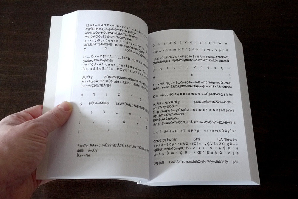
Amongst the potential uses include a device for visually impaired people to wear that could provide the user with information relating to things within their immediate vicinity that would be relevant to their predicted needs. For example the device might inform the wearer of a seat nearby if it 'felt' that they might like to sit down or rest.

I particularly like the literary angle to this. In this instance the machine was given the contents of the writing community Wattpad (a site which, according to Wikipedia, is a host for articles, stories, fan fiction, and poems). What if it were given the complete works of Oscar Wilde or the out-put of the controversial writer Michel Houellebecq? Would its predictions be tainted by the author's world view?

Could this technology bring authors back from the dead? Could a machine create a new Shakespeare play given access to his works and an input of our choosing? Articles are already being written by computers, so this may not be as far-out as it seems.

It puts me in mind of Deep Thought, the computer that calculated the answer to 'Life the Universe and Everything' in Douglas Adam's Hitchhikers Guide to the Galaxy series. With access to all those works of imagination, what might these machines learn about the human race that we don't already know about ourselves? Perhaps within our lifetime's we may begin to find out.

Deep Thought, revealing the answer. Image Credit: Igor Canova.

[Chris]

Wednesday, 10 February 2016

GUEST POST. Stepping away from Practices of Print: from Book to App (Zoë Aubugeau-Williams)


Minilab is a new digital production company created to deliver the most beautiful experiences in visual storytelling, learning and play that children can get their hands on.  Starting out as the digital R&D of Nobrow and Flying Eye Books, Minilab was set up as a new company in January of 2015 by Nobrow-co-founder Alex Spiro and digital creative James Wilson. At Minilab, we adopt the same basic values of great design of the highest quality that our sister companies are founded upon. We work with teams of talented animators and developers along with expert academics and the best illustrators in the world to ensure that we create the very best digital products for children that parents can rely on. We’ve recently released our first app, Professor Astro Cat’s Solar System.


 Professor Astro Cat first appeared in the book Professor Astro Cat’s Frontiers of Space, by illustrator Ben Newman and quantum physicist Dr Dominic Walliman. Professor Astro Cat and his friends act as a conduit to spread scientific fact in a fun way that children can enjoy. He wants to make learning fun because when done with love and humour, learning is easy.

It has become one of the best-selling books on the Flying Eye Books list, selling 90,00 copies worldwide, having been translated into 13 different languages! With Minilab’s intention to create beautiful, educational, digital content for children and with this proven track record behind it, Professor Astro Cat became the obvious candidate for this new project. James has a background in animation and had previously collaborated with Ben on the creation of animated GIFs of Professor Astro Cat, so it was definitely his first choice for a project too.


One of the earliest stipulations of the digital Astro Cat project was that, even if we were going to be covering similar educational content, the app should not be a straightforward conversion of the book. Astro Cat’s world and mission has been reimagined to create a brand new digital experience. There are plenty of ebooks and enhanced digital books out there that stick to the tropes and practices of print. The end result tends to look and feel like a glorified PDF, which is something that we really weren’t interested in. We thought that if we were going to develop a digital experience that started life as a book, we should offer something that a book can’t.


 When designing layout for a book, there is usually only one destination size. For example, in the book, the whole Solar System is shown across a double-page spread.
With an app, the design of the layout needs to be flexible enough to work across a whole range of devices ranging from squarer tablets to wider aspects found in smartphones and smaller devices. With the Solar System in the app, we get to see the planets up close whilst giving the user the understanding that there is more content ‘offstage’. The zoom function is a great example of playing to the strength of the format.


The app was built using Unity 3D, a powerful C# based platform that can run both 3D and 2D animations. Having the facility to use simple 3D models for the planets makes light work of conveying the planets spinning on their axes whilst maintaining the 2D flat aesthetic of Ben’s artwork. This adds another level of information to the illustrations in the book.

Breaking the page was very important. The digital app needs an anchor for all the information to move away and come back to. While a book is a more linear experience in which you physically go back and reference things, if you choose to. It was very interesting to adapt this because you have to design in a very different way. You need to think about what the viewer can’t yet see and how to take them there without the viewer feeling instructed.


Books are what we know and love. They can be wonderfully rich and accessible sources of information, entertainment and inspiration. With a Nobrow/Flying Eye Book we go as far as we can to to offer something that readers can’t get anywhere else.  In the Astro Cat book, we’ve presented educational content within a fully illustrated context, demonstrating the power of visuals to illuminate text in print. With mobile devices taking up ever-increasing amounts of eye-time and the devices themselves becoming more and more ubiquitous, the digital revolution is not letting up. Children are both drawn to and adept at this new technology and we want to make that screen time matter. It follows that with our digital offering we should be offering experiences that users can’t get anywhere else. Animation can add an extra element of life to visuals; animating Astro was a great way of expressing his character through motion. But digital experiences really come into their own when there are things a user can affect - making passive consumption OF MEDIA, active. So there’s lots to uncover, prod, swipe, read and also… play. By playing to the strengths of the digital format, we have allowed children to explore their own personalized, beautiful and educational adventure through space.


Zoë Aubugeau-Williams
www.nobrow.net
www.flyingeyebooks.com


Wednesday, 25 November 2015

the web within a book the book within a web

Recently we have been asked by the British Library to submit our site http://collectiveinvestigations.tumblr.com for the http://www.webarchive.org.uk/. This has got me thinking about how the internet has a vast wealth of data that a library could potentially collect. They currently hold 14,929 websites represeting 27.48TB of data which is a small portion of the 957,324,487 websites that are currently on the internet. (http://www.internetlivestats.com) 

‘The UK Web Archive contains websites that publish research, that reflect the diversity of lives, interests and activities throughout the UK, and demonstrate web innovation. This includes "grey literature" sites: those that carry briefings, reports, policy statements, and other ephemeral but significant forms of information. Because websites are revisited and snapshots ("instances") taken at regular intervals, readers can see how a website evolves over time. The archive is free to view, accessed directly from the Web itself and, since archiving began in 2004, has collected thousands of websites.’ (http://www.webarchive.org.uk/)

It is interesting how the the websites are given book like qualities. Collected by a library and presented to readers, in much the same way they would collect and catalogue a book. 

_

I have been looking at some artists and projects that explore this notion of collecting and the place the internet and the library have in relation to this. 


One of them being Chris Gibson from our collective with his work the Unassuming Collection. 


The book holds within it links to books that can be read online. Using the form of the book to collect and present these other books. The book becomes a library. A library of texts that sits between both an online collection and a physical one.


the unassuming collection - Chris Gibson
‘The Unassuming Collection is a paperback comprised of double-page spreads, featuring a disjointed but unfolding narrative on the left hand and a visual fragment (marginalia, an image, isolated text) taken from an existing book, on the right. The story refers to an imaginary library, but the images are taken from existing books. Below the right hand text is a QR code leading to a location where the book can be borrowed online, turning the fictional collection into an actual one.
The artwork emphasises the book’s role as archive – or keeper much more than its pages belie.’ (http://chrisgibsonart.blogspot.co.uk/2014/05/in-progress-unassuming-collection.html)

Another project I have come across is the Library of the Printed Web. http://libraryoftheprintedweb.tumblr.com

Library of the Printed Web is a physical archive and Tumblr devoted to web-to-print artists’ books, zines and other printout matter. It is also the publisher of Printed Web. Founded by Paul Soulellis in 2013, Library of the Printed Web is “web culture articulated as printed artifact,” characterized as an “accumulation of accumulations,” much of it printed on demand. It has also been described as an archive of archives. Techniques for appropriating web content used by artists in the collection include grabbing, hunting, scraping and performing, detailed by Soulellis in “Search, Compile, Publish,” and later referenced by Alessandro Ludovico.

They have collected together a lot of really interesting projects that like Chris’ book straddle that physical/digital divide. 


Experimental Publishing Studio at Rhode Island School of Design, COOKING WITH DOG, a one-hour Google doc book. With Jordan Hu, Drew Litowitz, Jane Long, Zhurong Qian, Francesca Capone, Mina Park, Stephanie Low, Ming Zhen, Lizzy Lim, Gyu Won Lee, Julie Rhee, Yoo Jin Jang. Spring 2015.


Mishka Henner, _IMG01 Australian-troops-passing-014.jpg. Self-published, PoD, 2014. Edition of 97 signed books and a 5x7 silver gelatin print. 740 pages.


Wednesday, 23 September 2015

→ books & braille: reading with the fingertips

↓ 

At BABE earlier this year I met a Norwegian artist Randi Strand. Randi's work reflects on the physicality and meaning of language signs, exploring relationship between signifier and signified. Randi showed me her recent book BERØRINGSSTROFER, which runs a Norwegian text alongside a text in Braille. Norwegian words are printed in a gently raised glossy ink. A bind person would be able to read the Braille and detect the physical presence of another text without being able to read it. A sighted person, on the other hand, will be able to read the Norwegian text (subject to the knowledge of Norwegian!) and see the presence of Braille as asemic writing. This beautifully light and poetic book combines tactile and visual pleasure of reading.


↓

When we close our eyes, the object between our fingers loses visual cues - such as title, text, colophon, index, images. Books become blank books - or libri illeggibile - books devoid of traditional attributes of book in favour of acoustic and tactile experience. (Reading Book as an Object, 2015)

Indeed, some books become less blank than the others: some books are produced for tactile reading and they can only be read with the fingertips. In those books materiality of the object merges with the verbal and the visual content into one tactile experience of a very physical reading. They are the books for the blind.

↓ 

David Rumsay Map Collection holds a 1837 embossed atlas for the blind. The atlas is printed in Boston Line Type - it was not until 20th century that New England Institution for Education of the Blind adopted Braille. 

L: Back of embossed New Hampshire map page. R: Explanation of New Hampshire map. From atlas of the united states, Printed for the use of the blind, at the expense of John C. Cray; under the direction of s.g. howe. at the n.e. institution for the education of the blind. Boston 1837.(SLATE)

L: Back of page holding explanation of Vermont map. R:New Hampshire map. From atlas of the united states, Printed for the use of the blind, at the expense of John C. Cray; under the direction of s.g. howe. at the n.e. institution for the education of the blind. Boston 1837. (SLATE)

↓ 

Contemporary embossed maps are produced by Princeton Braillists. The master drawings are duplicated by the Thermoform process to make clear, sharp copies onto plastic sheets, which are bound into volumes with cardboard covers and spiral plastic binders.


from OUTLINE MAPS OF THE WORLD

from ATLAS OF NORTHERN AFRICA

from BASIC HUMAN ANATOMY


↓


A few years ago Illinois Rare Books and Manuscripts library found a 19th century Moon's "First illustrated reader": a book for blind children, published in Moon type and decorated with eight embossed illustrations.


Bellow is a beautiful contemporary Braille edition of Piccolo Principe, with embossed illustrations, including this image of a boa constrictor digesting an elephant.


↓

A very promising appliance for the blind was featured in September 2015 issue of BBC Focus Magazine. BLITAB - a tablet which will allow the 285 million of blind and visually impaired individuals to finally enter the "tablet revolution". BLITAB is the first affordable (potentially) and light tablet for the blind. It was developed by an Australian startup: it creates Braille out of tiny, liquid-filled bubbles. Up to 15 lines of Braille can be displayed, while built-in software can convert text into Braille from websites or USB sticks. BLITAB can also display graphs, pictures, maps. It is expected to go on sale in 2016.


 ↓

The final body of images come from a photographic work by the above mentioned Norwegian artist Randi Strand. Her series Memoria feature a set of seemingly insignificant images overprinted with Braille, forming a drawing of embossed writing.
The works are at the same time images of language and inaccessible language images. They conceal their message and convert communication into decoration. One language decorates another. She complicates them, takes them apart and reassembles them in new ways. She challenges us to ignore the meaning of signs and draws our attention to the signs as such, in other words, to the visuality of language – as form, movement, image. In this way the signs are emptied of their original meanings, without becoming meaningless in the process. (text by Mari Aarre)
 [post by Egidija]