Showing posts with label art: books. Show all posts

Wednesday, 25 October 2017

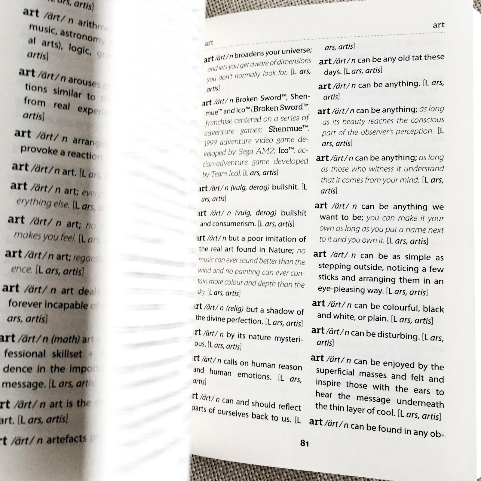
art /ärt/ n hacking the human. [L ars, artis]

Some years and some wine later Robert Good's "A New Dictionary of Art" is finally out!


If Robert Good was Socrates, he would have gone to Agora in Athens - to the tables, shops, workshops, barbers -  and discussed the definition of art with the public. Instead, he went to internet - the contemporary global Agora of chatrooms, forums, institution webpages - and asked the same question. The cacophony of voices that he received back, he presented in the book A New Dictionary of Art.


As a mesmerising accumulation of over 3000 definitions compiled from internet, the book is a glorious monument to undefinability. "A New Dictionary of Art" has all the definitions of art you had ever imagined: by critics, art historians, students and casual ramblers though Constable’s landscapes. And then there are some more definitions. And then another few  and some you may totally agree with. And then a few more and another one which may sound like something Aunt Bessie would say. Two hundred and thirty pages contain neatly arranged long and short explanations, which range from goddamn serious (art is an effort to contextualise our existence, p.53) to whimsical (art is an egg’s idea of things that aren’t eggs, p.53). The volume of alphabetically sorted definitions is too vast to contain any conclusion of what art is, yet it provides a fascinating dip into a dazzling world of opinions of the English speaking world. Each voice in the dictionary is undeniably individual and unique. Each statement and different. Any effort of finding a common thread is futile.


The book is a serious dictionary of art: pronunciation included (✓), part of speech included (✓), origin of the word included (✓). Two column design (✓). It feels solid (✓) . It weighs well. (✓). It has many pages (✓), chart of pronunciation (✓) and the list of abbreviations (✓). 


A New Dictionary of Art is a white flag in the search of meaning for the word “art”. Its captivating kaleidoscope of disparate opinions shows enormity of the task with which humanity has been struggling for centuries. This dictionary is spellbinding in both its madness and profoundness. Like an object of art, it “exists to inspire”. (p. 101)


[Egidija]


Wednesday, 21 September 2016

Liberature : Literature in the Form of the Book (Sally-Shakti Willow)


a4285e0b-thumb 

Based in Krakow, Poland, Katarzyna Bazarnik and Zenon Fajfer are creating, curating, documenting and theorising a literary revolution : Liberature.  Since Fajfer coined the term in 1999 – which could be used not only to describe the kinds of works that he and Bazarnik were creating together but could also be applied retrospectively to works by writers such as James Joyce, Stephane Mallarme, William Blake and Laurence Sterne and equally applied to a range of more recent and contemporary works by writers such as B.S. Johnson and Jonathan Safran Foer – the couple have been prolific in producing, publishing and researching around this previously undocumented area of literary activity.
Katarzyna has published widely in academic contexts on Liberature, including the 2014 Incarnations of Material Textuality, and has a book forthcoming this year.  Zenon’s collected essays from 1999-2009 can be found here.  Together they edit and run the Liberature imprint at Krakow-based small publisher Korporacja Ha!art, which has published several notable works including the first publication in Poland of Raymond Queneau’s One Hundred Thousand Billion Poems, a specially-formatted version of Mallarme’s Un Coup de Des following the writer’s original directions for the text, and the first foreign translation of Nobel Prize winner Herta Muller’s Der Wächter nimmt seinen Kamm.  The Liberature imprint has also published works by B.S. Johnson, and publishes a range of liberatic works by Bazarnik and Fajfer themselves.

Liberature takes its name by replacing the Latin ‘liter’ (letter) with the Latin word for book, ‘liber’, which also means ‘free’.  

What distinguishes Liberature from literature is the focus on the form of the book as an integral element of communication within the structure of the whole.  Where generally the bound codex is rendered invisible – and in the digital age, almost obsolete – as simply the carrier of the message of the printed word, Liberature recognises and foregrounds the book’s physical materiality as a vital component of the literary work printed onto its pages.
What distinguishes Liberature from the Artist Book is that the primary focus is on the literary text in its relationship with the book object – the marriage of material form and literary content – where the Artist Book in general explores the possibilities of the book form without requiring specific literary content.
On 12th August, Joe and I met Katarzyna and Zenon at the Liberature Reading Room in Krakow where they showed us their collection and spoke about their work.  The Liberature Reading Room is a research resource housing books from their own personal collection, theoretical and scholarly publications, promotional material and press clippings, all related to contemporary and historical works that are considered to be works of liberature, or ‘liberatic’.


Liberature Reading Room, KrakowLiberature Reading Room, Krakow


The book for which the term was coined, Oka-leczenie (2000), is formed of three interlinked codices bound together – a deliberate decision to present a physical experience of the book’s content in material form.  Spanning the stories of a death, a birth and an intermediary period between the two, the book can opened at the beginning of any of the three codices which never end but open onto one another in an intentionally endless cycle. Thus the book is no longer an invisible component, subordinate to the text in the communication of meaning, or at least intention.  In a work of Liberature, the material structure of the book is employed as an integral dimension of communication in the design of the text as a whole.  This, for those who have attempted it, is a radical act that questions some deeply held assumptions.
The focus of Western literary production and its critical reception has overwhelmingly been on the words of the text, rather than the design of the book as an object.  This echoes the cultural prejudice that has traditionally valued the intellectual over the physical.  The physicality of the book remains invisible and unquestioned, as it has largely been the intellectual work of the writer in creating the text that has been most valued.  In this way, it’s become easy to ‘lose yourself’ in a good story – the physical act of turning the pages becomes no interruption to the mental and intellectual act of reading the words and reconstructing an imaginary narrative.  But this kind of reading can neglect, or at worst negate, the body: the physical processes at work not only in the act of reading, but in the experience of being human.  To me, this replicates the age-old theological dichotomy between the body and the soul, which again demonises the former in favour of the latter.  Liberature aims at bringing the material form back into play, to foreground its relationship with the immaterial and raise questions about its role.

The codex form itself, far from being an innocuous and insignificant vehicle for the written word, developed at a culturally and spiritually significant point in time.  The first codices were Coptic – designed to encode the biblical narrative.  In the structure of the codex form, with its linear temporality and teleological focus, we can see the structure of the biblical narrative embodied in material form.  Every novel ever written and produced within this set of structures is to a greater or lesser degree reproducing the structure and story of the Bible.  Its structures and codes have dominated our narratives for so long that they are now an unconscious and unquestioned part of our lives, shaping the ways that we think, interpret and experience the world.

For these reasons and others, I believe it is the vital work of writers and artists to draw attention to and question our unconscious assumptions about the material form of the book.

In his ’emanational texts’ – the literary texts that become the content for the liberatic material forms – Fajfer goes further still in probing the relationship between the physical and the spiritual.  Each book contains both a visible text and an invisible text: the invisible text emanates from a close reading of the first letters of each word of the visible text, until only a single seed word remains.  The seed word becomes both the origin and the end point, or the birth and the death, of the visible text on the page.  In this way, both the visible and the invisible carry equal significance and weight, as each gives rise to the other.


8d4dcede-thumb
Oka-leczenie, Katarzyna Bazarnik and Zenon Fajfer (2000)
An exploration of the relationship between the physical form of the book and the physical form of the body, and the energising of silent spaces in relationship with the word, are integral elements in the work of our book The Unfinished Dream, which we donated to Katarzyna and Zenon for the Liberature Reading Room while we were there.  It was exciting to discuss our work in the context of Liberature: particularly being told that The Unfinished Dream is a liberatic project in their opinion.  Overspilling the boundaries of the codex, The Unfinished Dream is also a performance and a film with each element of the project designed to foreground the relationship between the physical forms of the book and the body and the interrelationship between word and silence in speech and on the page.

The physical object of the book is a central concern of The Unfinished Dream.  The project explores the ways that the materiality of the book is ignored and made invisible at the expense of the words and ideas it contains, in a similar way to the relationship between the physical human body and the concepts and ideas that are generated by the mind.  The Unfinished Dream explores writing, drawing and creative practice as embodied, physical processes – processes that take place in, of and through the body, and which may be experienced physically, viscerally and emotionally by those who come into contact with them.  The foregrounded interrelationship between word and silence is intended to raise questions about the relationships between self and other, subject and object, writer and reader: creating a non-linear multiplicity that requires the collaboration of the reader to engender meaning.

It was incredibly inspiring and energising to meet with Katarzyna and Zenon to discuss Liberature, and we’re grateful to them for their generosity and their genuine interest in our work as well as the vibrant and animated conversations we had that sparked so many ideas.  We hope to continue the conversation for many years to come.
 
  Sally-Shakti Willow


Wednesday, 15 June 2016

Documenting Artists' Books

After a recent embarrassment of handing out a business card to a friend and gently being asked why my website was almost empty, I resolved to spend some time bringing it up to scratch (i.e. adding at least some coherent content to it!).

Original - Cover
Original - Interior
Starting the process I soon remembered why I had given up months before. Building a website and adding content in a straightforward, appealing way is quite a challenge and central to that challenge is taking clear documentation. I overcame the problem in quite a straight forward way, so I wanted to talk about it here. I'll use the example of an artwork called 'Between the Lines'.

The two original photos (above) were taken with my smartphone from the slightly battered proof copy that arrived from the printer. It was hasty because I wanted to get the photos on my website in time for them going on sale at the Whitechapel Book Fair. Shamefully I've been using those photos ever since!

One simple way of establishing how I wanted the new documentation to look was by addressing what I didn't like about the old photographs:
  • Both of my original images were cropped and didn't give a true impression of the cover design or the page layout. I had originally taken the photos like this in an attempt to make them look visually interesting and (particularly regarding the cover) to hide the roughness of the book itself. As the book is merely documentation, I realised that clarity was more important than visual interest, so documented the cover and pages in their entirety and from above.
  • Both images are different sizes (one square, the other rectangular), so they looked uneven next to each other. The simple solution to this was to choose a standard size - making them square meant that I didn't have to remember what ratio I had picked.
  • Using my smart phone camera meant that the colours were very uneven. The simple solution to this was to use a better camera.
  • The background didn't match other documentation, so I opted to pick a particular shade and use that across all my documentation.

Strange how these things sound so simple, but had never really occurred to me before. So I set up a little studio in my front room and took some photos with my compact camera.

Using this set-up the only two elements that I needed to control were the background and quality of the image. These could be done together in Photoshop. All I had to do was to separate the book and the background and work on them separately.

For the book element I improved the contrast and changed the colours slightly to match the original. For the background I increased the contrast so that the paper textures of the background disappeared, but the shadow stayed. I then filled the background with a specific shade of the grey that provided a contrast. Noting down the details of the shade of grey were important, as I then used the same shade on all subsequent documentation. The finished images are here:

New - Cover
New - Interior
Below these are other books that I documented using the same technique - I hope it gives you an idea of how straight forward the process can be.

Mrs Dalloway Variations

Mrs Dalloway Variations


[Chris]

Wednesday, 8 June 2016

GUEST POST: The Book as Utopian Object (Sally-Shakti Willow)


For my practice-based PhD in utopian poetics and experimental writing at the University of Westminster, I’m researching the utopian philosophy of Ernst Bloch and the artist books of Theresa Hak Kyung Cha.  I’m coming towards the end of my first year, and the first fruit of creative practice is the project called The Unfinished Dream, a collaborative work with illustrator and animator Joe Evans.

The Unfinished Dream began as an experiment in applying Ernst Bloch’s utopian theory to creative writing practice, inspired by the text works of Theresa Hak Kyung Cha.  Both Bloch and Cha explore the relationship between subject and object (self and other).  Bloch suggests that the experience of non-alienation, where the subject (the individual) experiences itself as not-separate from the object (the world/the other) is the essence of the utopian.  Cha embodied this desire to create an experience of non-alienation between the subject and the object in all of her major text, film, and performance works.  The Unfinished Dream experiments with these ideas and has developed into a collaborative project that keeps growing and shifting – an unfinished and unfolding creative process.

For Bloch, the utopian function of art and literature is to facilitate the ‘self-encounter’ (100), the recognition of oneself in and through an encounter with the other.  For Cha, as for Bloch, the art object becomes a space of encounter between the artist and the audience where each fulfils the roles of both subject and object in their interrelationship with one another through the work.  One of the forms used by Cha for realising this connection was the artist book.  The book is an object of intimacy, a space in which the reader and writer are drawn together through the page.  The book, as an object, is designed to be held and engaged with in a one-to-one relationship between the writer/maker and the reader.  Cha uses scriptovisual techniques to create a relationship between text and space, words and silence, self and other in her artist books.

I’m interested in exploring this strange relational space between artist and audience, writer and reader, self and other as an experiment in the kind of non-alienation that Bloch ascribes to the utopian function of art and literature.  I’m interested in the ways that the book form can facilitate this kind of an encounter between subject and object, self and other.  What kinds of spaces need to be opened up within the text for the reader to project herself into?  How might the relationships between text and space / word and silence / text and image / image and space engender a performative experience of non-alienation for a reader encountering the book object? 

To experience something, we often need to encounter it physically, via our sense organs.  In this sense, and in others, the physical relationship between the book and the body is integral to the project.  I’m also deeply interested in the physicality of the book form, its materiality and its function.  Below, I describe some of the processes and ideas behind the creation of The Unfinished Dream, the first part of my creative practice for this three-year PhD.

The Unfinished Dream illustration details

 ‘May I write words more naked than flesh, stronger than bone, more resilient than sinew, sensitive than nerve’. Theresa Hak Kyung Cha, Dictee
  
The Artist Book:
The physical object of the book is a central concern of The Unfinished Dream.  The experimental writing collection explores the ways that the materiality of the book is often ignored and made invisible at the expense of the words and ideas it contains, in a similar way perhaps to the relationship between the physical human body and the concepts and ideas that are generated by the mind.  The Unfinished Dream explores writing, drawing and creative practice as embodied, physical processes – processes that take place in, of and through the body, and which may be experienced physically, viscerally and emotionally by those who come into contact with them.

Similarly, the general invisibility of the book form means that culturally we take for granted the codex structure which has become synonymous with what a ‘book’ is.  Historically though, and across geographical and cultural spaces, different forms such as scrolls, wrapped papers, and now digital platforms have provided alternative ‘book’ forms with different relationships to structure, linearity and temporality.  The codex form developed with Coptic Christianity and encodes the linear, teleological (end-focused) structure of the biblical narrative.  What happens when we question these invisible assumptions that structure the stories we tell ourselves, and the stories we tell of ourselves, so implicitly?  The Unfinished Dream explores the human relationship to the codex form and the teleological narrative it encodes and embodies.

Ernst Bloch describes utopia as ‘in the process of being’ (15).  For Bloch, utopia is a process rather than a destination and as such it is non-teleological.  Cha’s major artist book Dictee embodies a non-teleological structure in that there is no temporal narrative development throughout the book, and her use of repetition to return to key thematic images and ideas gives the book a cyclical or circular structure, despite its codex binding.  The Unfinished Dream embodies a similar structural rhythm in an attempt to disrupt the teleological structure of the codex form via its content. 
The book also explores the relationship between words and silence as represented by the spaces between words and phrases on the page; the relationship between words and images; and the relationship between parts of words through the non-standard use of the square bracket.  Each of these relationships has the potential to generate multiple possibilities through the gaps in between two elements and/or the dissonance generated between two or more contradictory parts placed together.  This is intended to have a twofold utopian function in that it disrupts teleological structural development by offering a profusion of possible pathways through the book as well as situating the reader as a co-creator of meaning, as each person encounters and experiences the book differently.  In this way the boundaries between writer and reader become more permeable.  The  co-creative relationship between the reader and the writer/artist is at the heart of The Unfinished Dream, as the reader must complete and interpret the work of the writer and illustrator from the multiple possibilities that are offered both within and beyond the text.

When making The Unfinished Dream we also wanted to question some of the invisible assumptions which suggest that artist books must be artisan products, requiring specialist skills, materials and equipment to produce and displaying the skills of fine craftsmanship.  We love those kinds of artist books of course.  But we were interested in a kind of democratic creative process that didn’t fetishize the book as an object, that embraced real life physical processes and that aesthetically embodied the ideas contained within the book.

 
 A4 school exercise books, hand illustrated, cut and pasted
Binding with Sally’s hair
The Unfinished Dream – artist book
The Unfinished Dream – interior pages
The final poem is left unfinished, with space for the reader to complete the work


In addition to the artist book, The Unfinished Dream is also a short film and a performance.  Click here to watch the film (90 seconds; contains nudity).
To find out more about the project, including the film and the performance, please click here.
A still from the film, projected as part of the performance


The Unfinished Dream is a project by [Sub]Atomic Books: Sally-Shakti Willow & Joe Evans


Bibliography:
Bloch, Ernst (1988). The Utopian Function of Art and Literature: Selected essays, trans. Jack Zipes and Frank Mecklenberg.  Cambridge Massachusetts and London: The MIT Press
Cha, Theresa Hak Kyung (2001 [1982]).  Dictee.  Berkeley, California: University of California Press

Wednesday, 18 May 2016

Making Books as a Ritual

I was recently reminded of Donald Parsnips Daily Journal: a publication made and distributed daily by the artist Adam Dant in the Spitalfields over a five year period. The artist printed 100 copies each day and handed them out on his way to work.

Donald Parsnips Daily Journal - 8th July 1998. Image Source: Artnet.

When I first came across the artwork, during my BA in Fine Art I was inspired by it (and by a similar, and more intimate artwork by a friend Rose Clout), particularly for the artist's focus and persistence; the fact that day in and day out they kept creating. Collectively the body of resulting work had impact, in much the same way as a retrospective of On Karawa's date paintings might have; the artworks are tangible results of a quest for perfection. Some of the glow from these works may come from the realisation that the artist has sacrificed some part of their life to this cause. To a young artist as I was, there was something heroic in this and perhaps romantic; the struggling artist personified.

On Kawara's Today series. Image Source: Art Bouillon.

Ten years later when I embarked on my MA in Book Arts, I dabbled in this ritualistic process myself over the course of the works:

Your Day is My Day was a publication I created daily, produced and printed on the same day and left in a location related to the content. The intention was that someone would find the 'book' and realise it relates to the place they were standing and perhaps make them conscious of where they were at that moment and what they were doing; a prompt for self-reflection.

This idea morphed into another work of art a year later. For a group show called Overdue I placed a book wrapped in paper in a vitrine in Camberwell College's library. The book contained a QR code on the front, which linked to an ebook created by me that could be downloaded each day. The book changed each day, implying the fluidity of books within the digital realm.

Wrapped book in vitrine
Detail of artwork in one of the ebooks.


The next time I worked in a similar way was for an exhibition at bookartbookshop as part of Collective Investigations. I created four stacks of book pages, each with a brief story on each (relating to the place in the shop where they were left) and embedded with a QR code. When scanned the the viewer would be taken to a page online, where the text would be redrafted day by day until it became unrecognisable.

One of the stacks of paper in situ.
None of these projects were carried out on the scale of Adam Dant's or On Kawara's, but each was difficult and rewarding in their own way. On the positive side the projects pushed me to work to a deadline each day and the time constraints meant I couldn't be too precious about the end result. The time-pressure and the ongoing nature of the works pushed me to be inventive and think of something new each day and these ideas, although not groundbreaking themselves, did germinate other ideas for later artworks. The only real negative of this way of working was that the rushed nature of some of the works meant that individual details were not completed with the standard of quality I would usually work to.

[Chris]


Wednesday, 20 April 2016

The Complete Virginia Woolf - an eBook as a labour of love

Although I’ve changed ebook-readers a few times over the years, one book that has remained ‘constantly’ on my virtual shelf is the Complete Works of Virginia Woolf. It’s a beautiful volume, which seems to have been a real labour of love for the maker. I hesitated when I wrote the word ‘constant’, because as you’ll see the book as evolved a lot over the years.

The Complete Works of Virginia Woolf - book cover. Image source: Mobileread.
The Complete Works is an ebook created by the user Pynch on the ebook site Mobileread. As background Mobileread is an online community where users format and upload books that are in the public domain. In this case Pynch compiled the complete works of Virginia Woolf in one volume and uploaded it in 2012. Since then the volume has undergone 15 revisions (errors have been corrected, formatting conventions smoothed out and huge volumes of new material added).

When we think of books as a labour of love, I suspect ebooks aren’t the first things that spring to mind, perhaps a beautifully bound manuscript might be more apt, or something personalised in some way, or an example of excellent design. Ebooks have more of a cold, utilitarian connotation - they are after all devoid of so many elements we fetishise in paper books (the smell, the touch, the familiarity etc.)

Picture of Dorian Gray Interior
The Picture of Dorian Gray Cover
Book-binder Mark Cockram's beautiful books have been exhibited widely and often use mixed materials, striking end pages and interventions to the edges and interiors, enclosing and reframing an existing novel, to draw out certain plot points or create a certain tactility in the hands. (The images here show Cockram's bold rebinding of Wilde's The Picture of Dorian Gray).

The Complete Virginia Woolf has a cover that breaks from traditional convention (its restrained design and subdued colours compliment the text, without being showy or eye-catching) and uses Vanessa Bell's original woodcut cover designs to mark each individual work that comprises the collection. Instead of being merely a 9,500 page book, the use of Bell's imagery nicely packages the works, differentiating them from one another. Connecting Virginia's writing with the images that her sister conceived to accompany them, gives history to the collection, tying it to its original production.

Mrs. Dalloway section of the Complete Works.
Original Hogarth Press cover design by Vanessa Bell

Graham Rawle is a fascinating artist whose books often layer found imagery to build up a new story or give a certain depth or feeling to an existing one. The Complete Works of Virginia Woolf is a work in constant revision and as such also gains a certain gravity the more texts are added, or the further existing texts are revised or the design improved upon.

Pages from Rawle's Woman's World, 2005

Pages from Rawle's edition of The Wizard of Oz, 2008
Were this edition released by a major publisher we might remark what an achievement to bring such diverse material together, but to say the book is down to the labour of one individual means so much more. Our having evidence of the constant addition and improvement makes this all the more impressive, as it reminds us of the labour involved; with edition after edition we're made aware of the hands of the maker.

Penguin's Great Ideas series (released in 2004 and designed by David Pearson) is a excellent example of simple design and attention to detail that enhances a book, making it a pleasure to read. The designer's thoughtful and pared down aesthetic and attention to detail (such as the use of embossing and mixing type faces) harks back to both the simple Penguin covers of yesteryear and old fashioned printing techniques (such as letterpress).

Penguin Great Ideas Vol. 1 - spines
Penguin Great Ideas Vol. 1 - cover

One of the pleasures of The Complete Works is the crispness of design - typographic conventions are shared across the 30+ volumes that make up the collection and design is unified right across the 9,500 pages. In a world where even the big publishers can't always get formatting consistent (in a hard-back edition of Mrs. Dalloway I own the text is printed differently on alternate pages, making for a jarring experience and the references that accompany the text contain obvious errors), the ease of reading The Complete Works is refreshing.

As with many labours of love, the work has flaws (as each revision of the document testifies) but to say that it has been been created by one person, spurred on by helpful comments and encouragement, makes it all the more personal. Oh, and did I mention that in a bout of productive-procrastination I decided the Complete Letters of Virginia Woolf and Lytton Strachey  needed transcribing? You'll find it in this volume!

Why not pop along to Mobileread and get your copy now? Remember to keep checking back for revisions.

[Chris]

Wednesday, 16 March 2016

the typewriter


As part of our Gutter project we used a typewriter. The reason for us, was that it is the most transportable way of printing on site without having to have a computer and a printer.  It doesn't need electricity or take up a lot of room, so fits into our project quite nicely, allowing us to print a publication during the duration of the fair.


Photo: Pauline Lamont-Fisher


So I'm going to explore a few creative uses of the typewriter in various forms. 


Firstly this manual for the use of an Olivetti typewriter from the 50's. Though not intended as a piece of art it is beautifully designed and reads like a piece of concrete poetry. It sums up the modern differences in keyboard design which enthralled so many people at the fair. The 'experience' of the typewriter, the noise, the extra pressure you put on the keys added an interesting layer to the event. Also what I liked was that the backspace key pointed in the direction the carriage moved and not in the direction it now points on a modern keyboard. I wonder when this change in direction appeared?


I couldn't look at the typewriter without looking at concrete poetry which seems to form a big part of its creative use, like these typewriter drawings and poems by Carl Andre. It did strike me while using the typewriter the other weekend, that there is something quite freeing about an analogue way of working. If you don't mind not having perfectly straight lines of text, the typewriter works more like a drawing with a slightly less than precise form of mark making. 


While doing this typewriter research I came across this fun book by Ed Ruscha that I wasn't aware of. Some might be repulsed by it but it fits into this post on the creative use of a typewriter quite nicely. 

This artists' book documents the destruction of a Royal (Model 'X') typewriter that was thrown from a car travelling at 90 m.p.h. The book being an interpretation of Jack Kerouac’s 1959 novel, On the Road. Various parts of the typewriter that were scattered far and wide were documented along with the remaining body of the typewriter itself and the artist inspecting it. 


I'll leave you with this: 'The Typewriter' a piece of classical music from the 50's written by Leroy Anderson. Reminding us that the typewriter can not only be used to draw with, record text and be thrown out of a speeding car, but can also be used to make music. Enjoy!